THE PROBLEM: Petyr Rolls original site, though content-rich, was difficult to navigate, visually cluttered, and unintuitive for users unfamiliar with his work.
THE GOAL: Redesign the site to make it easier to read and navigate while preserving Petyr’s distinctive voice and unconventional layout preferences. The redesign needed to introduce structure and accessibility without erasing the personal charm of his aesthetic.
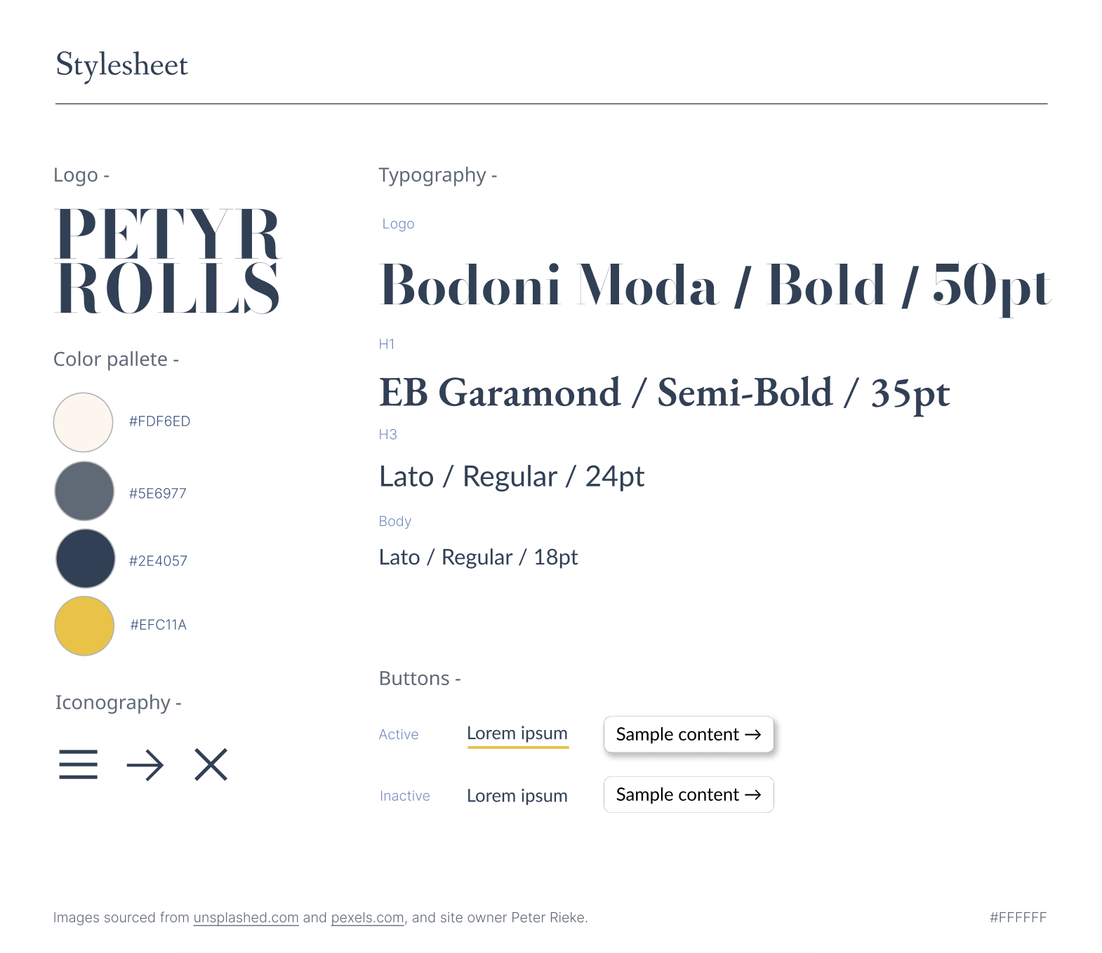
MY ROLE: UX/UI designer — responsible for user research, site structure planning, wireframes, high-fidelity prototyping, and coding final designs.
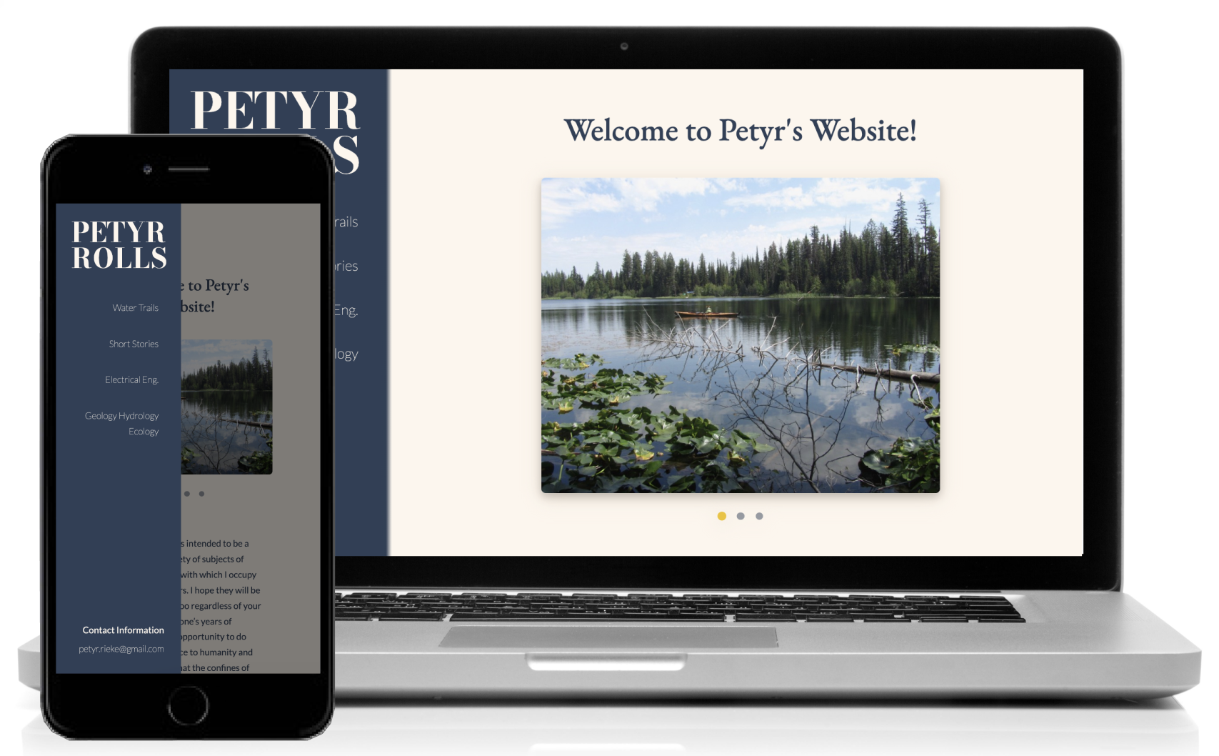
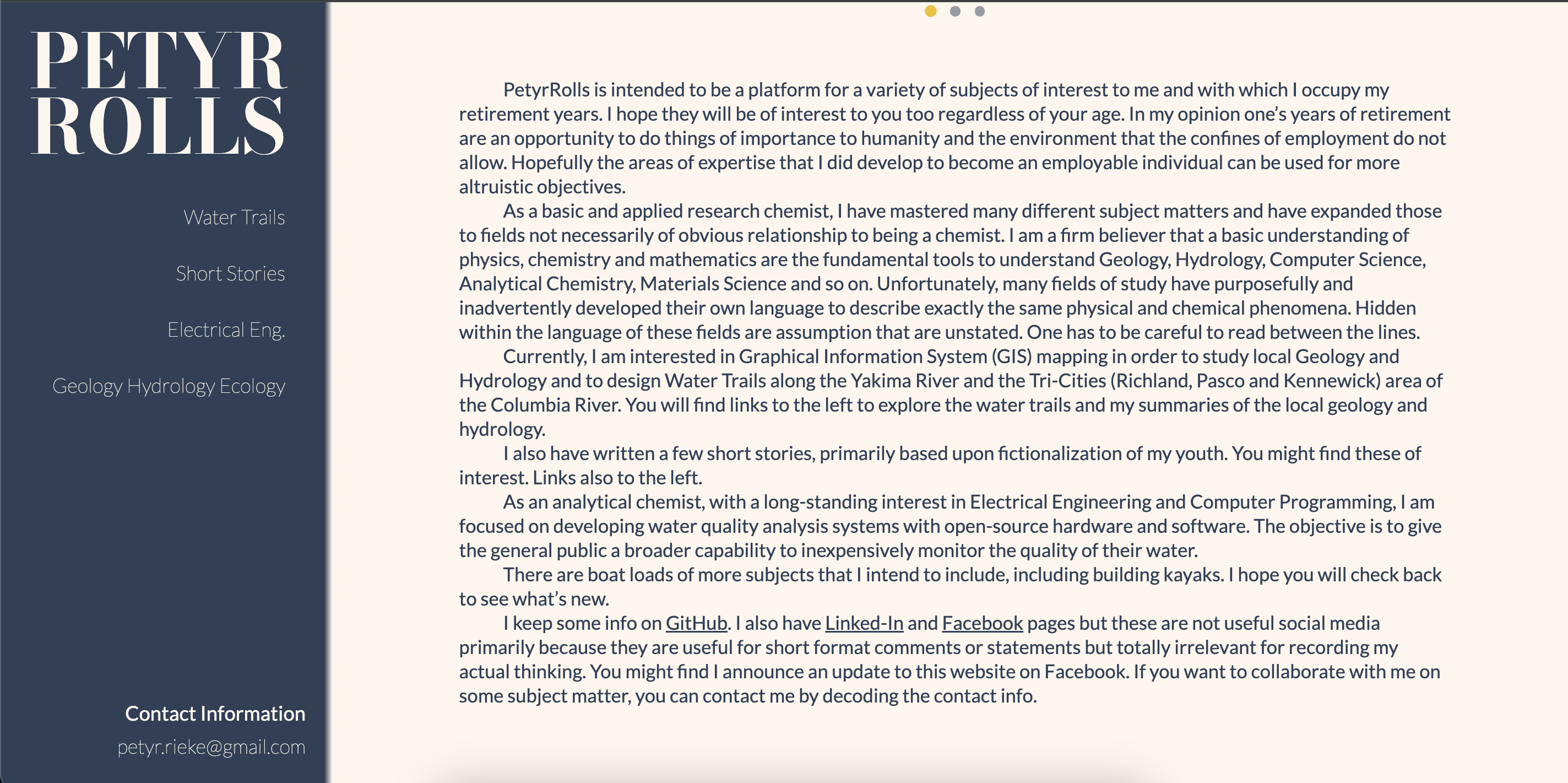
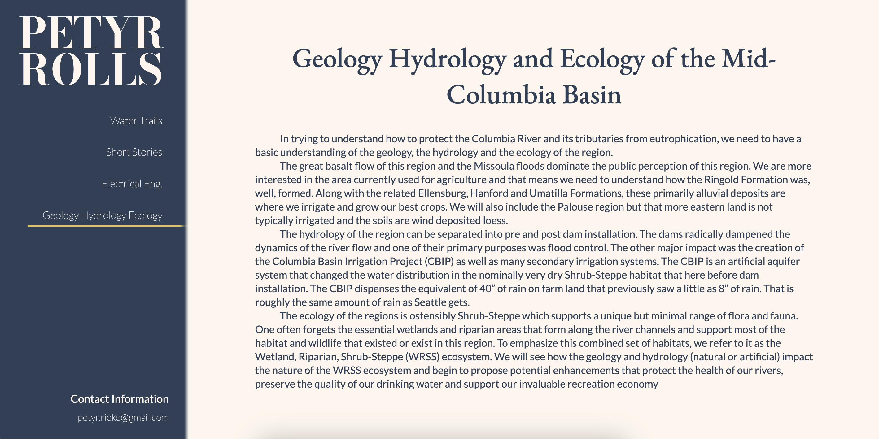
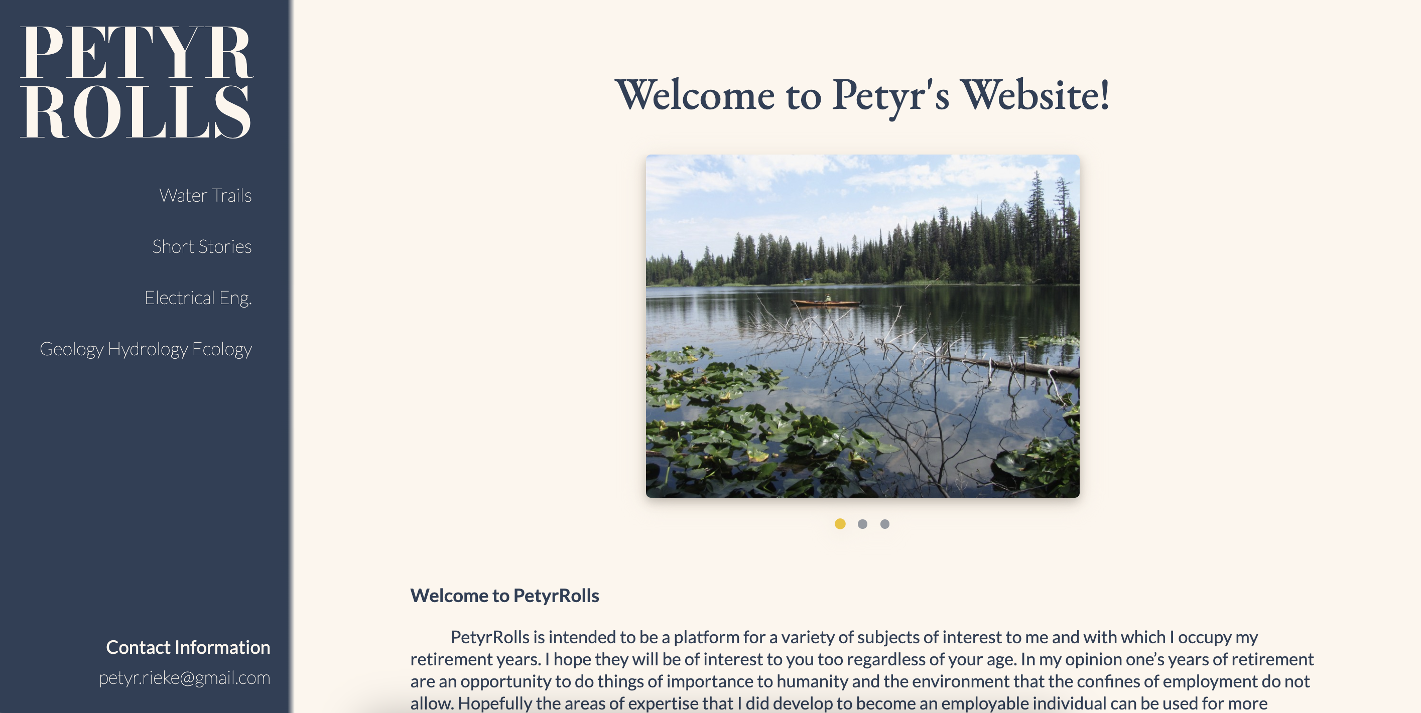
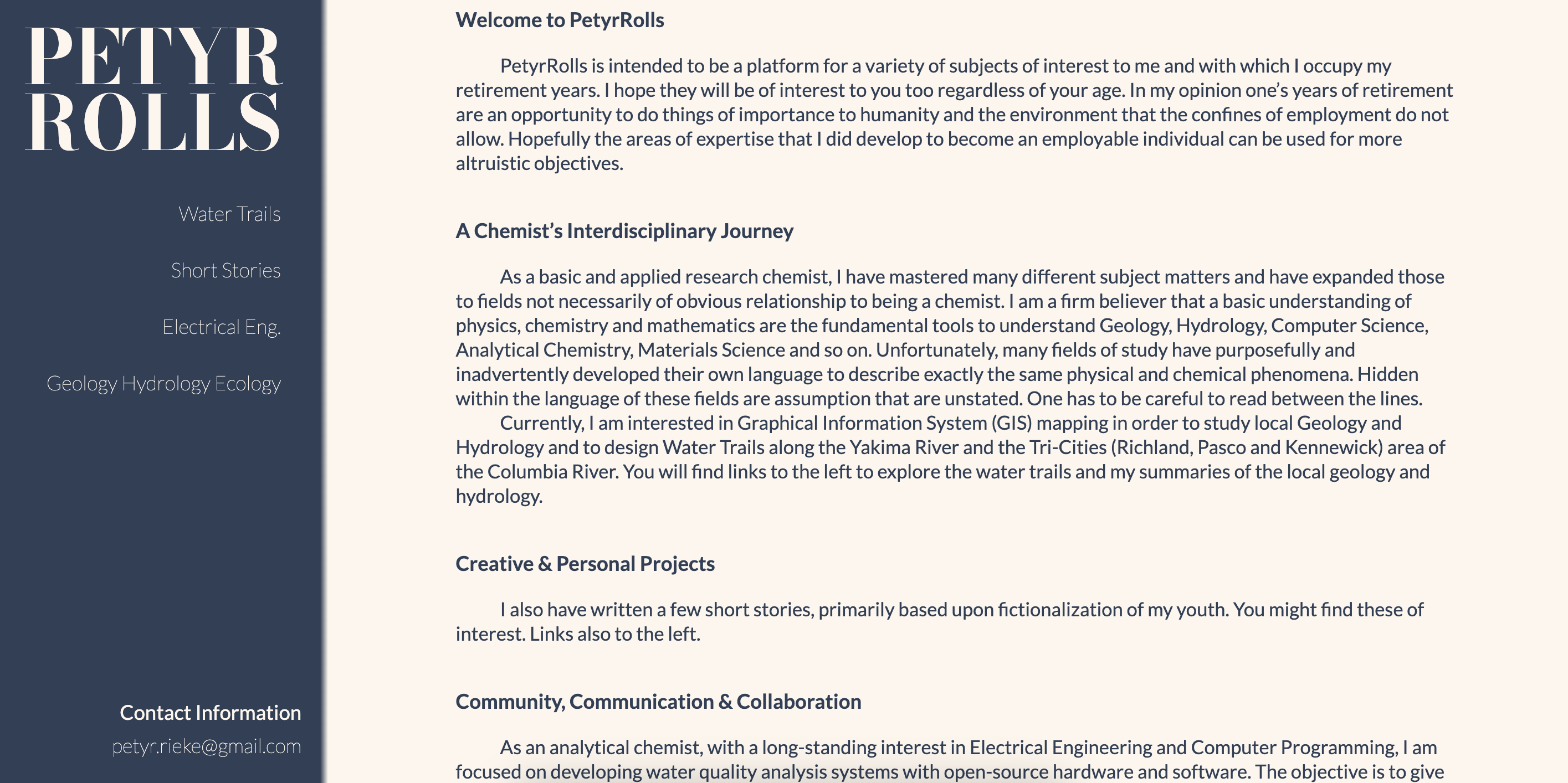
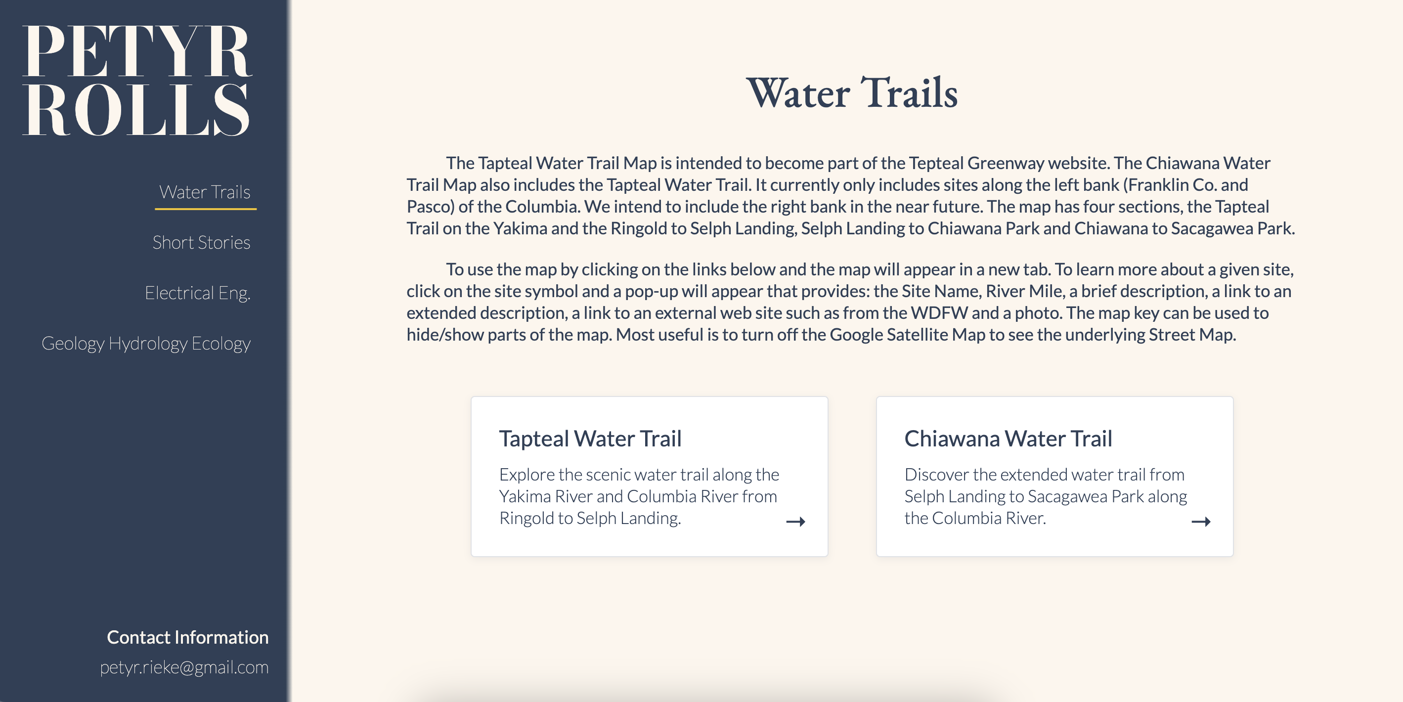
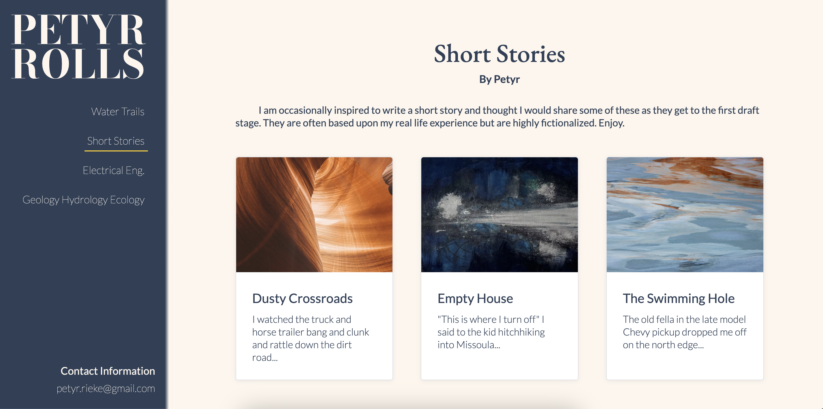
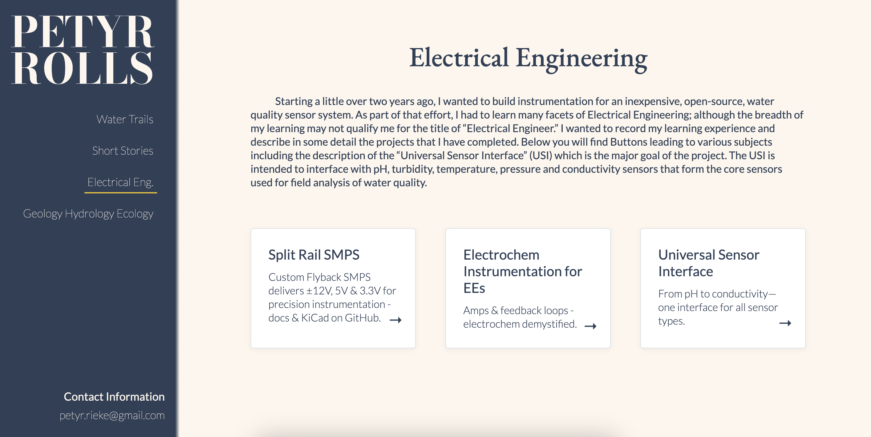
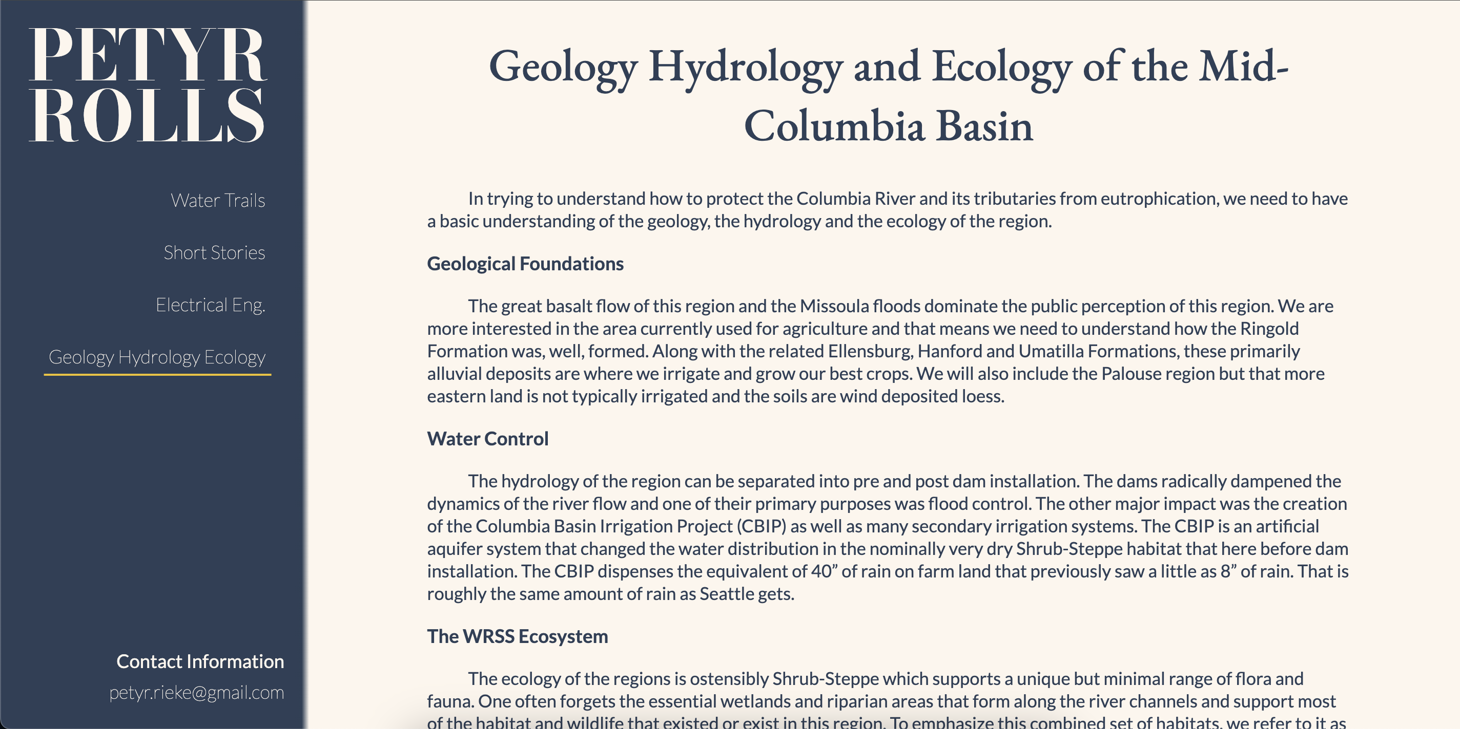
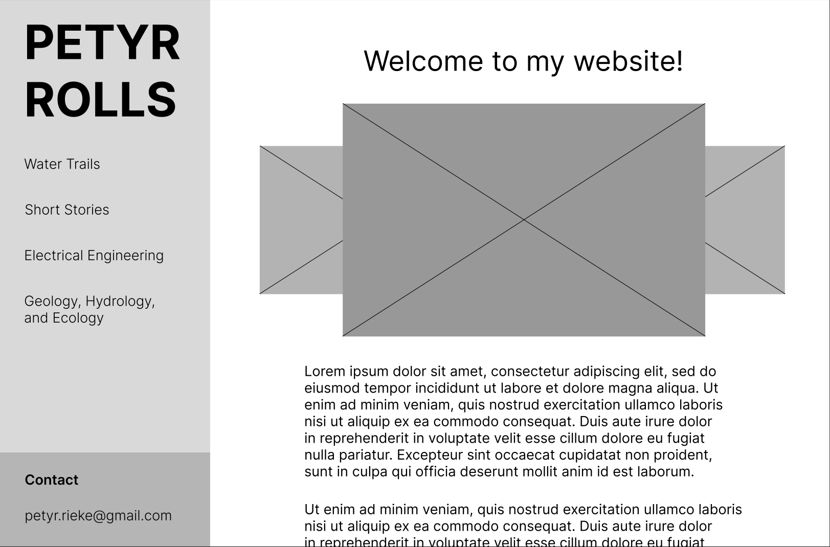
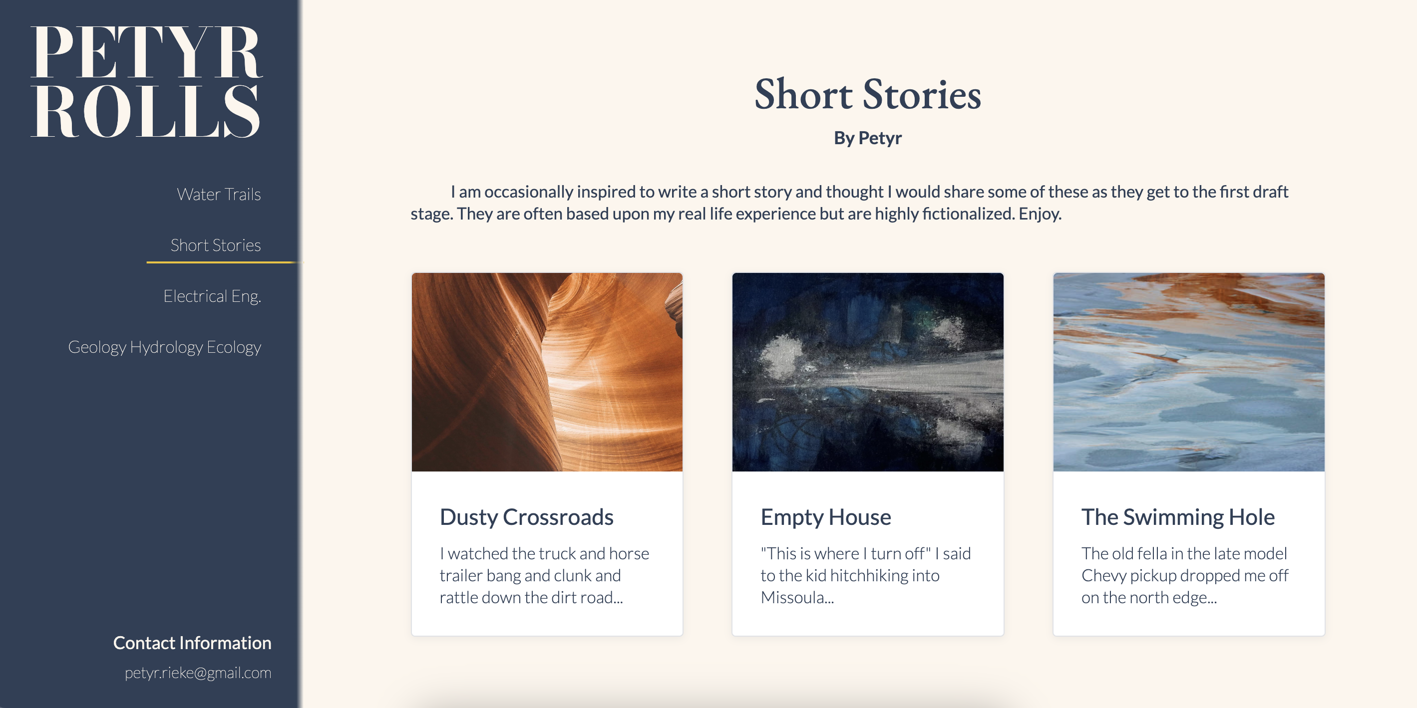
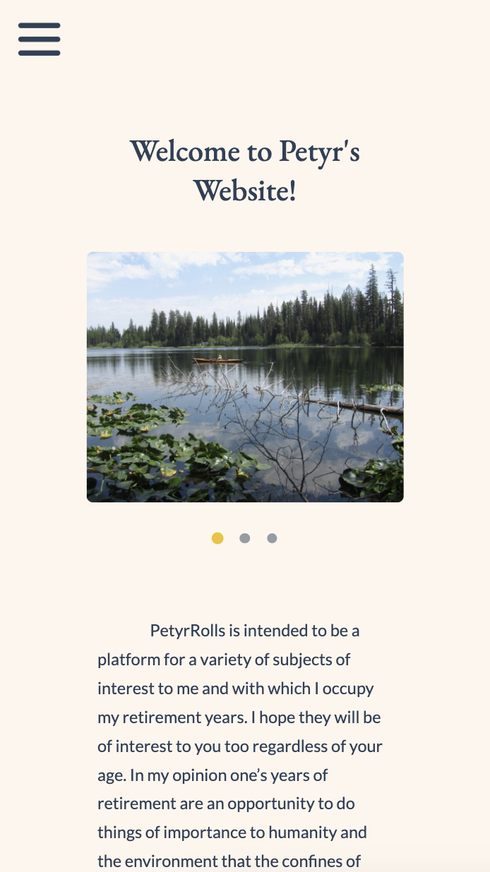
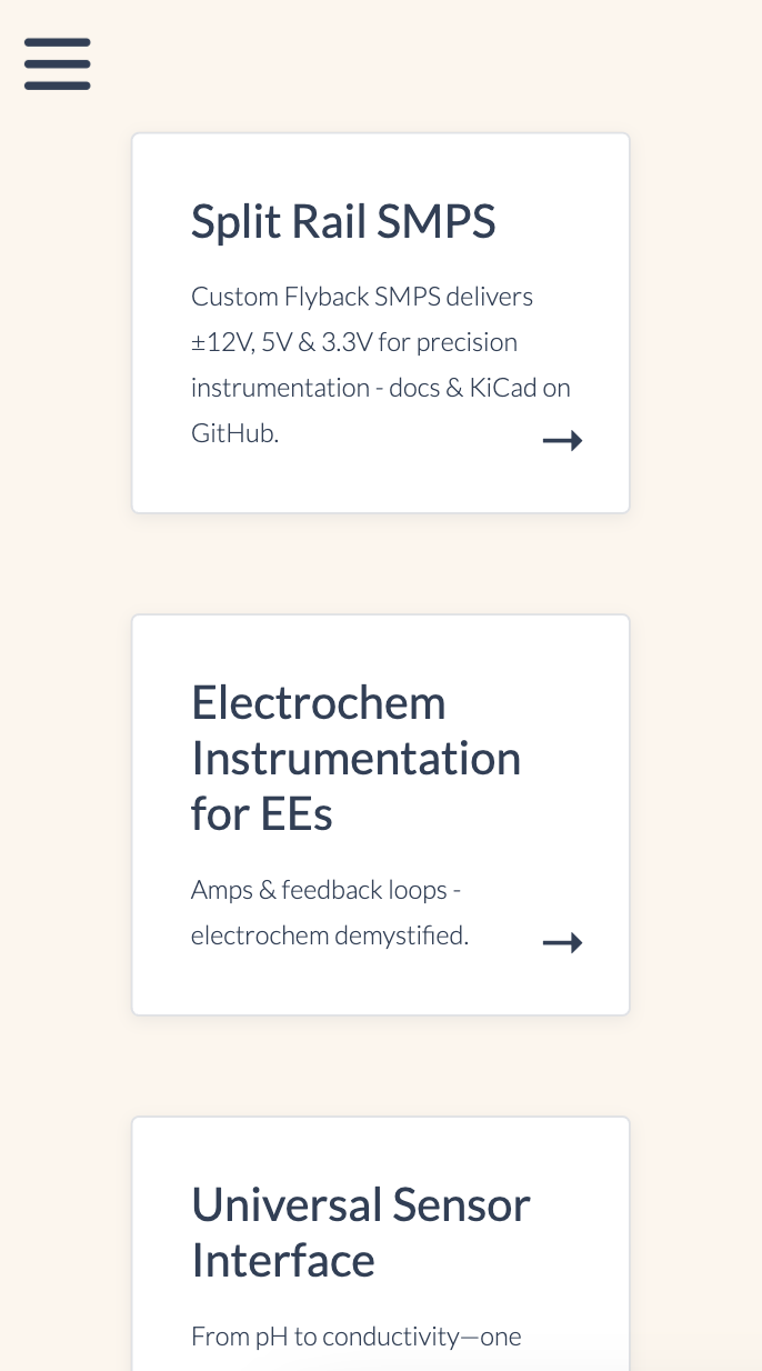
IMPACT: Petyr’s work is now clearly organized and accessible across categories such as GIS mapping, chemistry, geology, and short stories. Visitors can browse without feeling overwhelmed at petyrrolls.com.
WHAT I LEARNED: Sometimes the job isn’t about minimalism or trends, it’s about respecting the voice of the creator while improving clarity. Working with a client whose aesthetic is intentionally chaotic taught me how to prioritize usability without stripping away character.
NEXT STEPS
Integrate a CMS-lite or Markdown solution so Peter can update content without HTML.
Continue user testing with both longtime readers and new users to fine-tune accessibility and layout clarity.
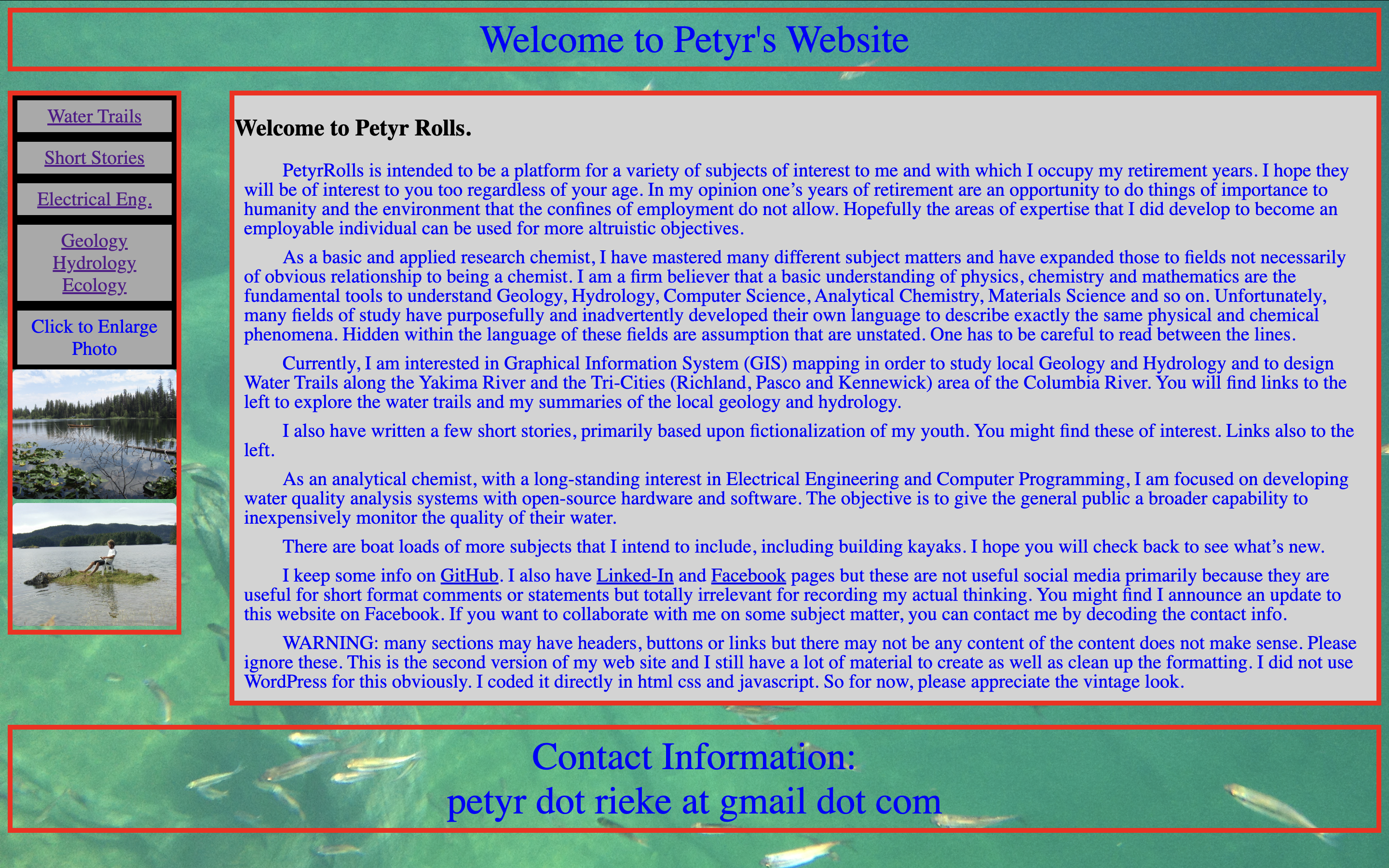
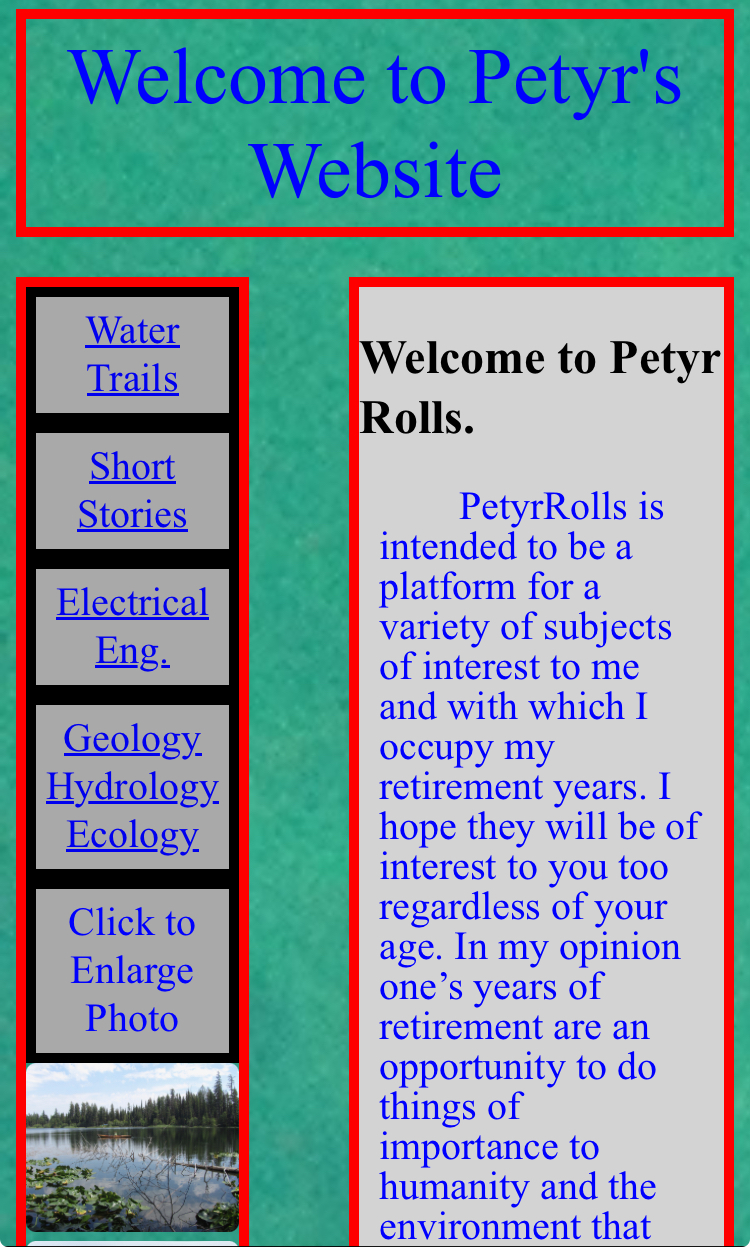
Outdated look & feel: The majority of users described the site as “old-school” or “like a 2006 website.”
Navigation issues: Users struggled without a back button and found labels like “Click to Enlarge Photo” misleading.
Clarity & purpose: Most understood the site’s purpose but found the structure unclear.
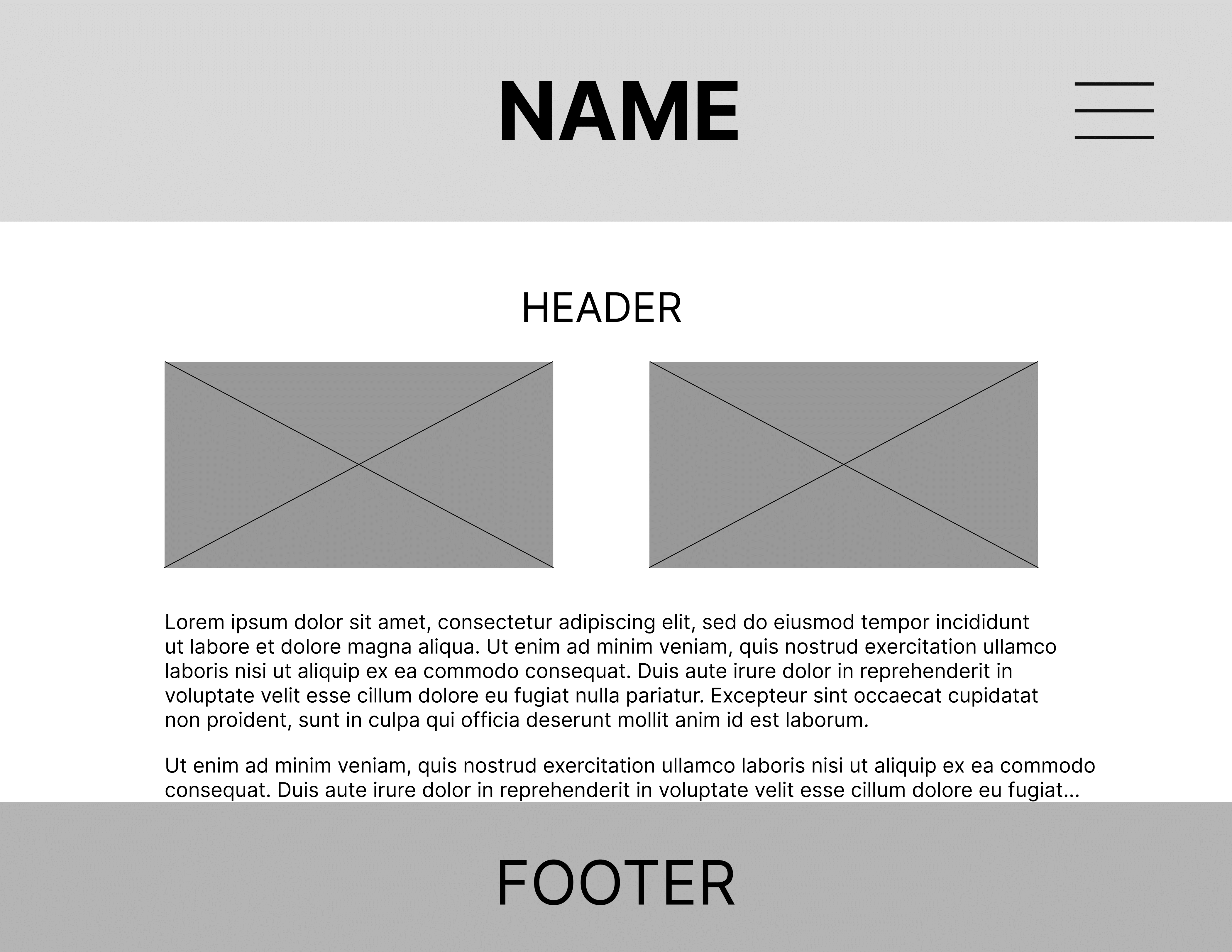
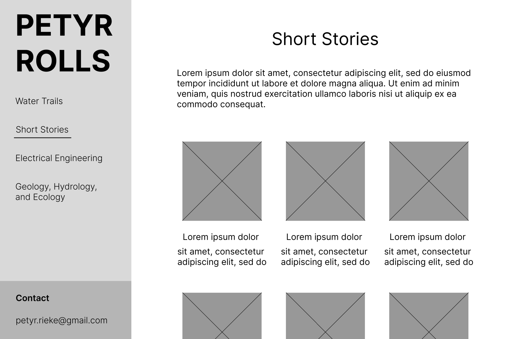
To explore different ways of balancing structure and personality, I sketched a handful of quick wireframes focused on layout, labeling, and navigation. Some leaned clean and conventional, others embraced Petyr’s chaotic style. Most didn’t make the cut—but working through them helped clarify what did matter to the client.
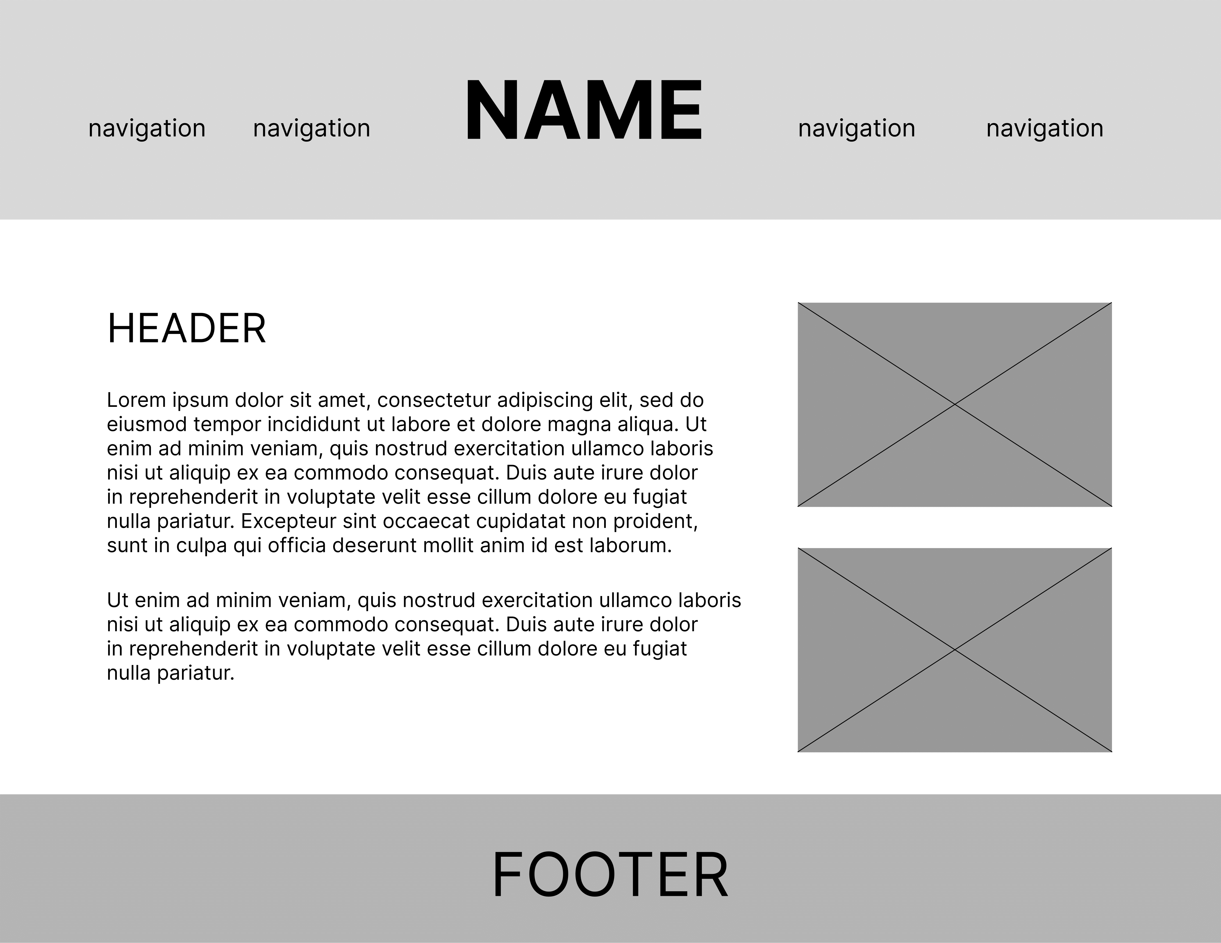
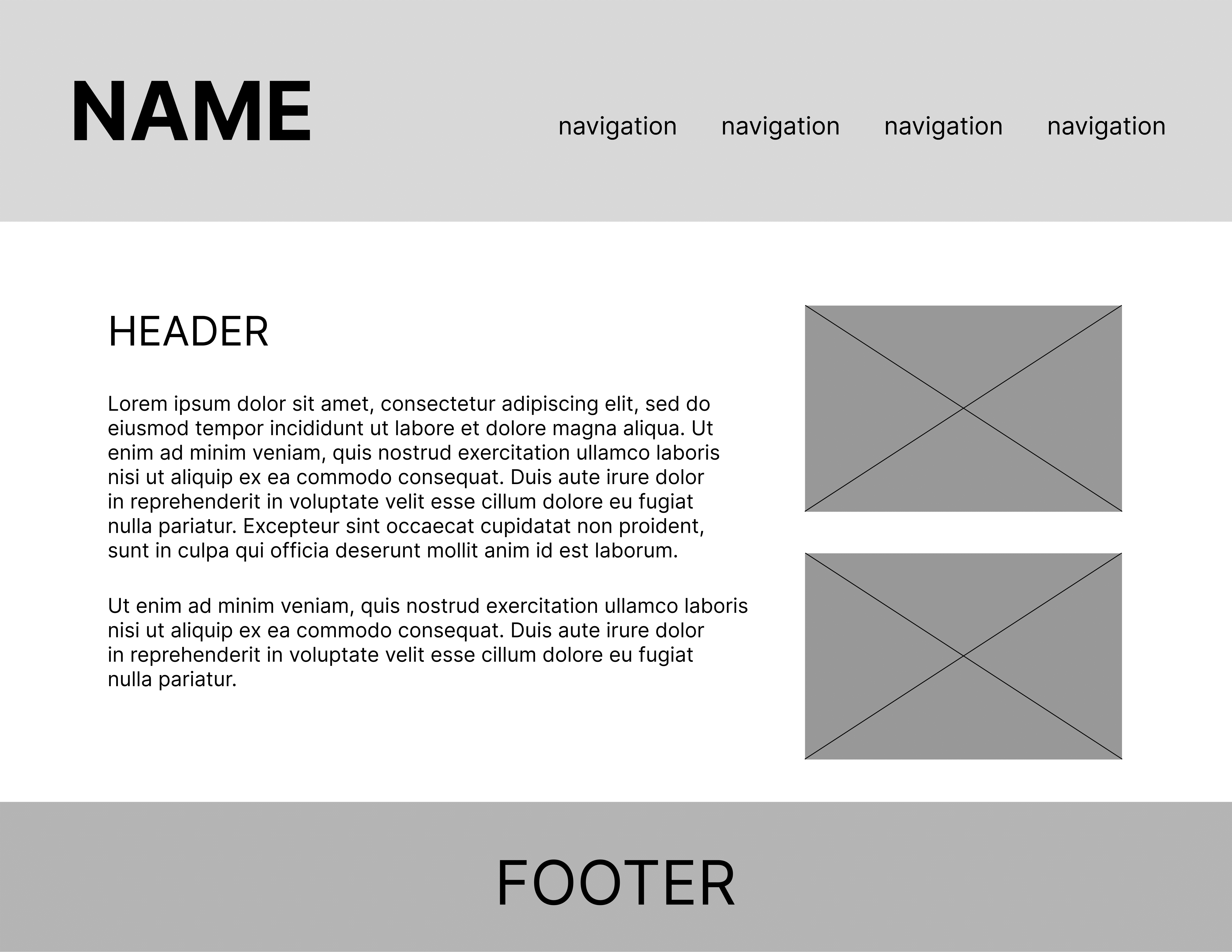
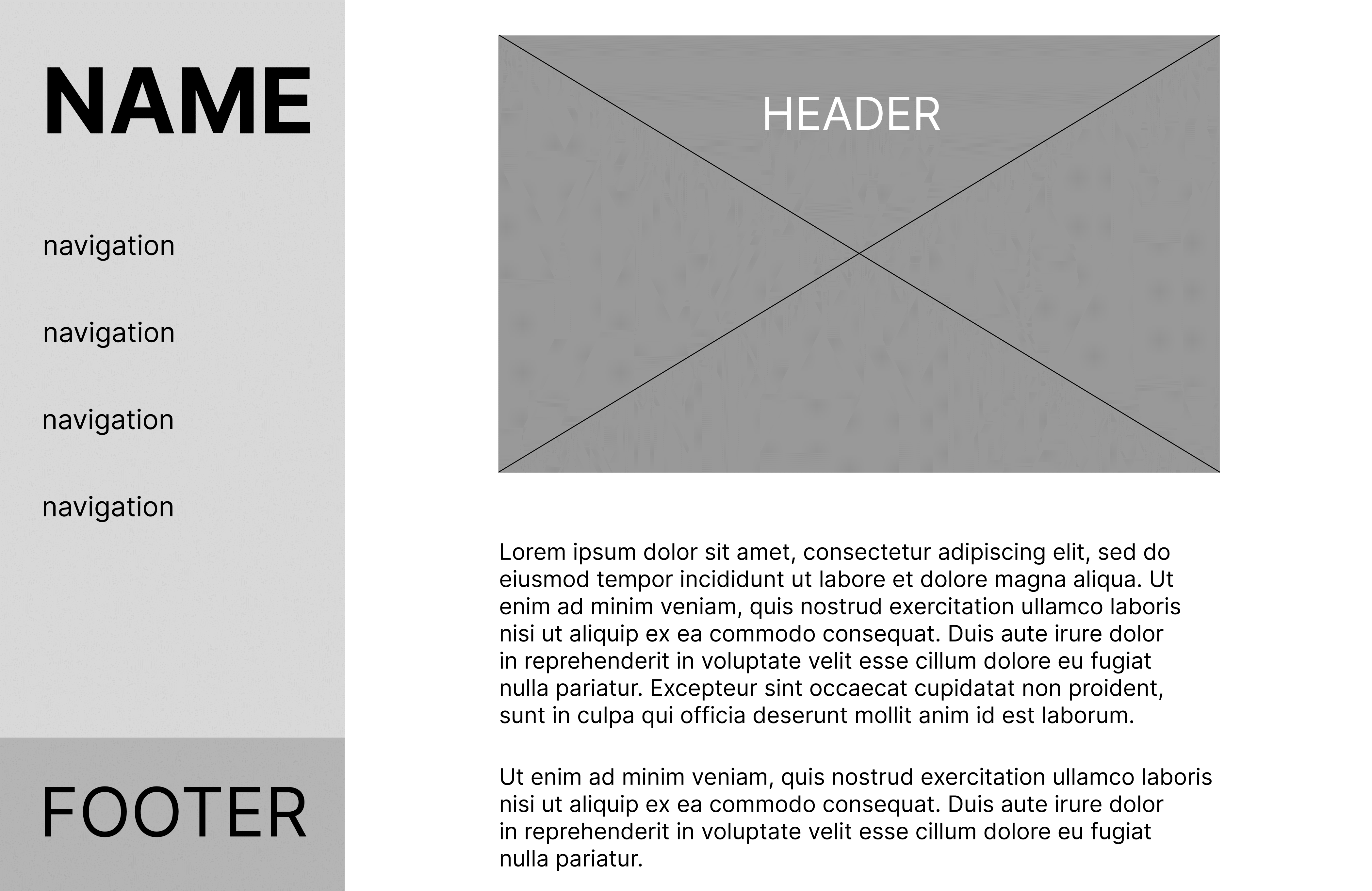
These wireframes explored categorizing content by theme (e.g. science, maps, fiction) and adding a sidebar-based navigation system.
Early ideas also included content section modals to reduce page length while organizing information.
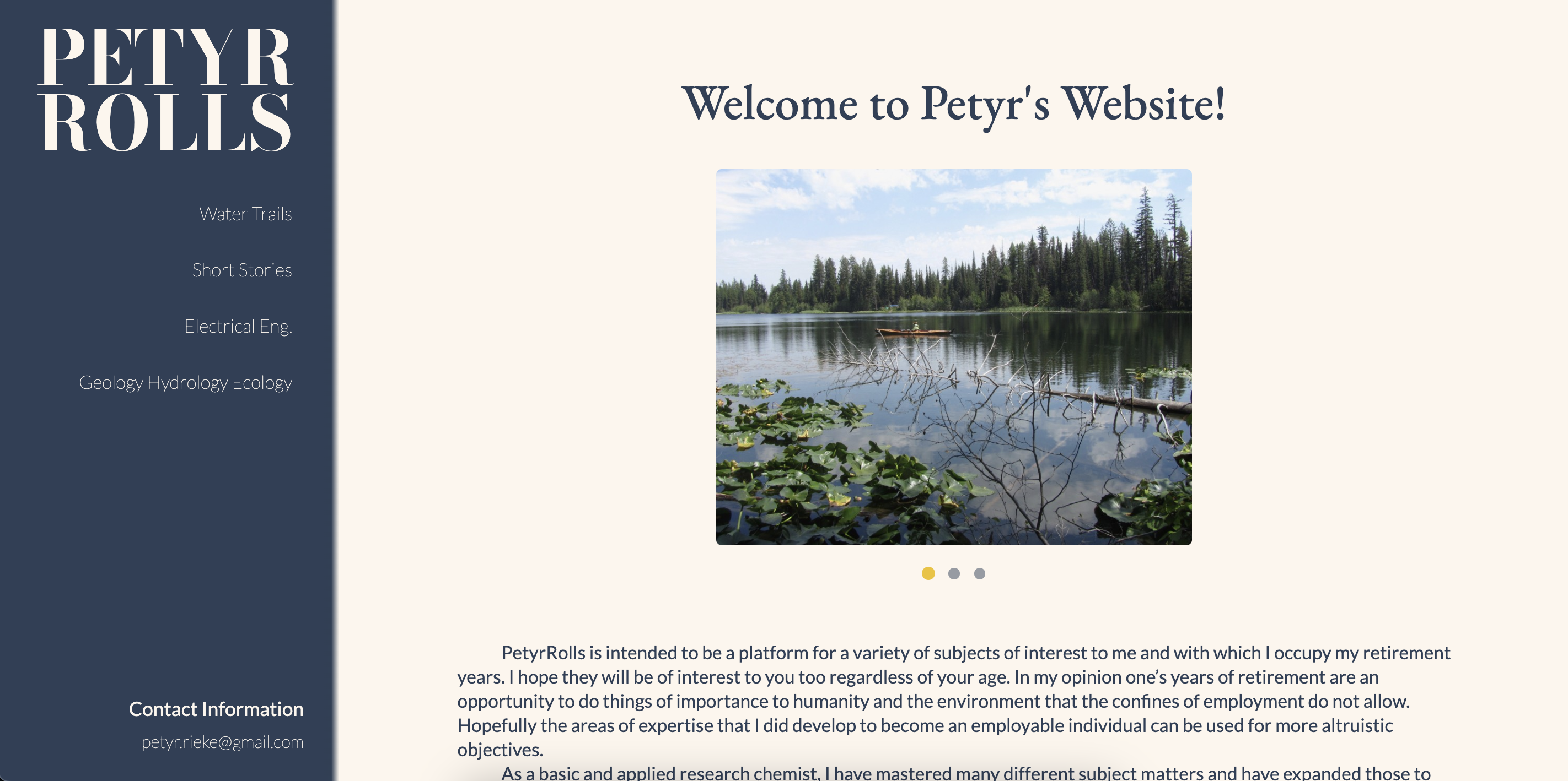
Aside from visual enhancements, I designed with mobile responsiveness in mind to ensure a seamless experience across devices.

Accessibility: Users were lost when reading large bodies of text.
Suggestions: Improve information hierarchy by breaking the text up into sections for users to better process large blocks of information.