THE PRODUCT: Beautiful Blossoms is a floral design and bouquet shop. Its primary users
are people ages 15-40 who want to order custom flowers for loved ones. (Project Duration: May – June 2022.)
THE PROBLEM: There is often a lack of bouquet customization options online, especially
around Mother’s Day.
THE GOAL: Design a responsive ordering experience** for Beautiful Blossoms
that allows users to easily customize and order a bouquet.
MY ROLE: UX designer and researcher; cnducted usability studies, paper and digital wireframing, low and high-fidelity
prototyping, accounted for accessibility, and iterated on the designs.
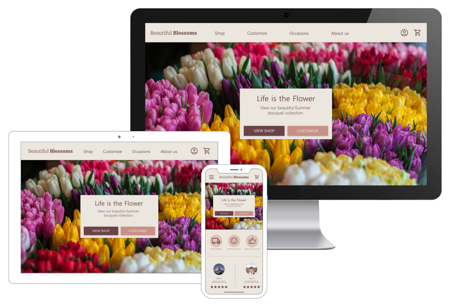
IMPACT: Beautiful Blossoms successfully appealed to its target audience by creating an **accessible** bouquet customization flow.
WHAT I LEARNED: I learned the importance of accounting for all users—whether that means designing for multiple screen sizes (desktop, tablet, mobile) or using high-contrast text for readability.
NEXT STEPS
1
Continue conducting usability studies to refine the user’s experience.
2
Complete other user flows for Beautiful Blossoms, such as account creation or ordering preset bouquets.
Using insights from a competitive audit, I created user personas to understand the target audience: typically ages 15-40, ordering flowers for loved ones. This primary user group confirmed my initial beliefs about Beautiful Blossoms. Common issues included user flow, accessibility, and product quality (e.g., ensuring that the delivered bouquet matches the user’s expectations).
PAIN POINTS
1
User Accessibility
Clearly visible navigation buttons and high-contrast text are key to reducing user pain points.
2
Product Quality
The delivered products sometimes don’t match what was shown online (e.g., quality or consistency issues).
3
User Flow
The user’s roadmap (homepage → checkout) can be cluttered with potential pain points, like unresponsive UI or confusing steps.
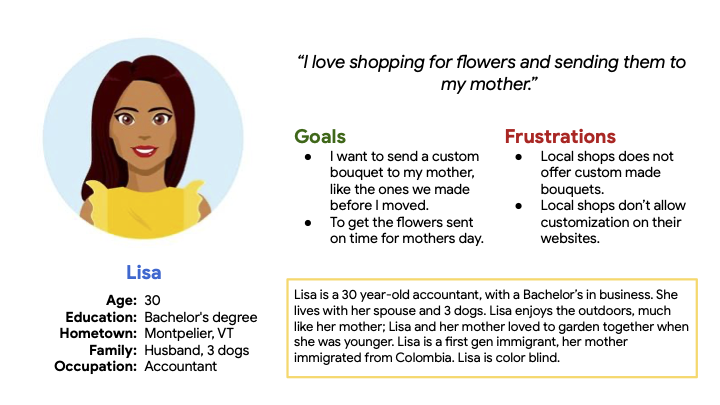
PERSONA: LISA
Problem Statement: Lisa is a daughter who needs to order a **custom bouquet** for her mother on Mother’s Day to revisit cherished memories from her childhood.
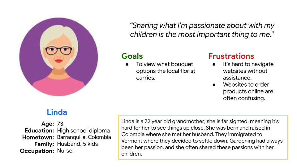
PERSONA: LINDA
Problem Statement: Linda is a grandmother from Colombia who’s always loved gardening. She passed this hobby to her daughter. She wants a **custom bouquet** that reminds her of home.
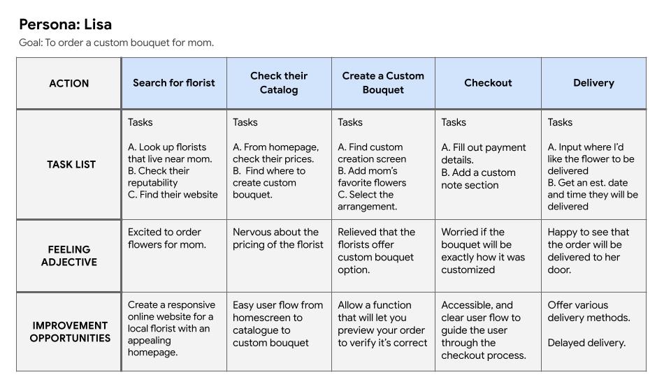
I captured Lisa’s experience step-by-step, highlighting roadblocks and improvement opportunities when ordering a custom bouquet.
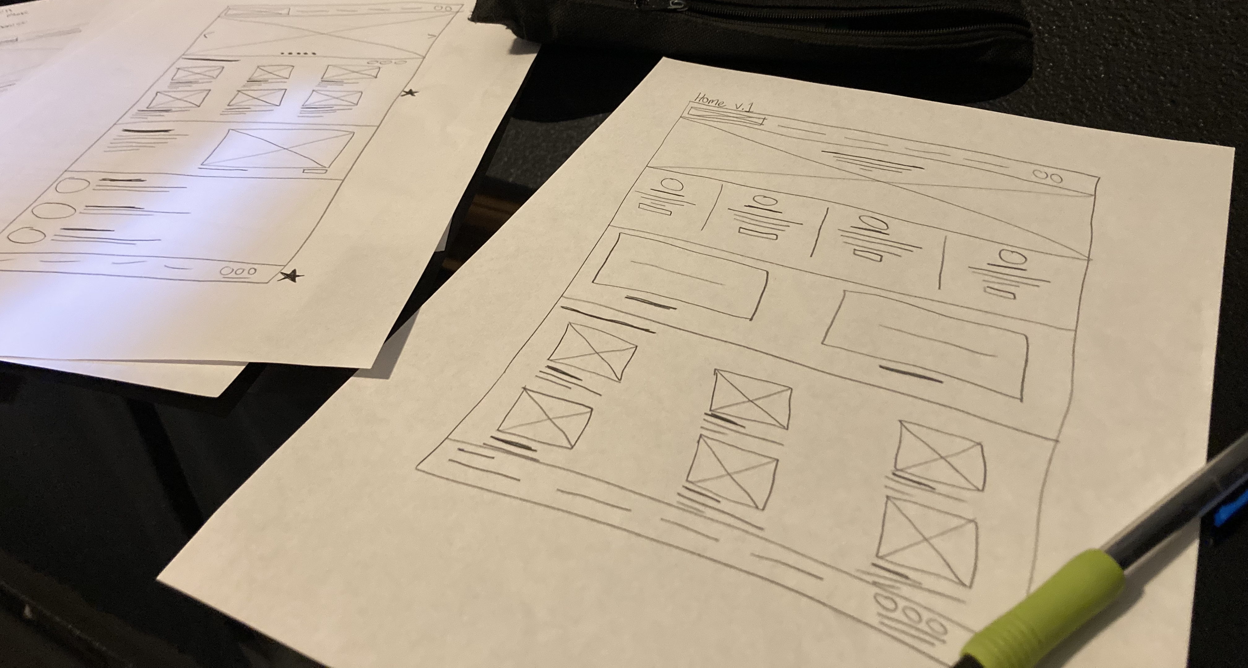
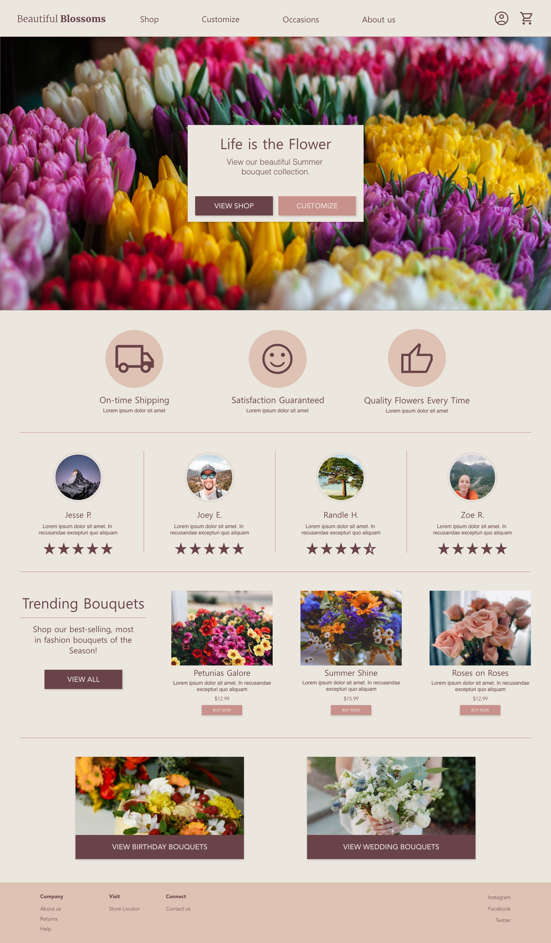
Iterating on wireframes for the homepage allowed me to pick the elements I liked from each draft and combine them to create the final homepage wireframe.
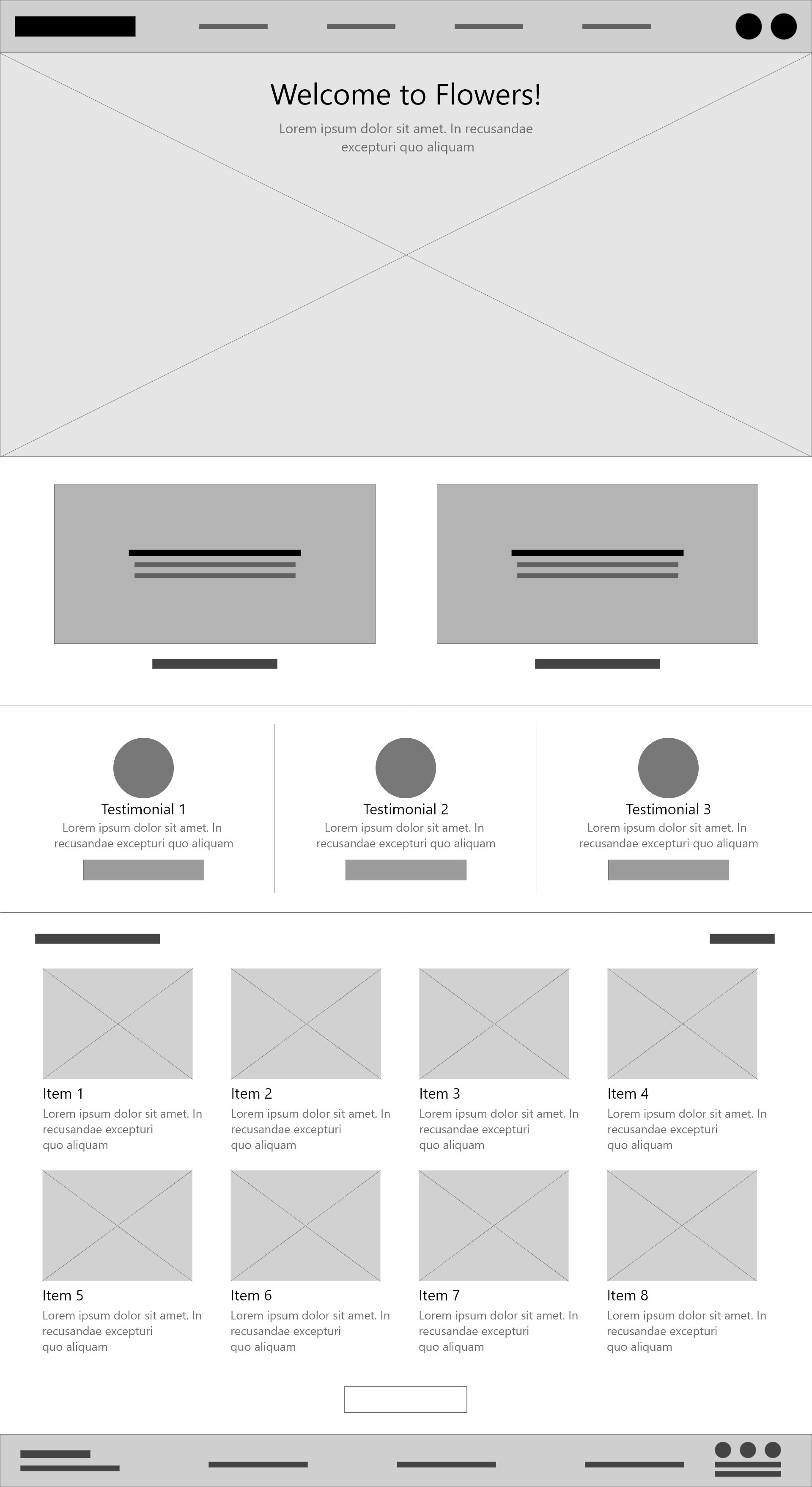
To address the first user pain point (usability), I made sure the homepage layout was logical and easy to navigate.
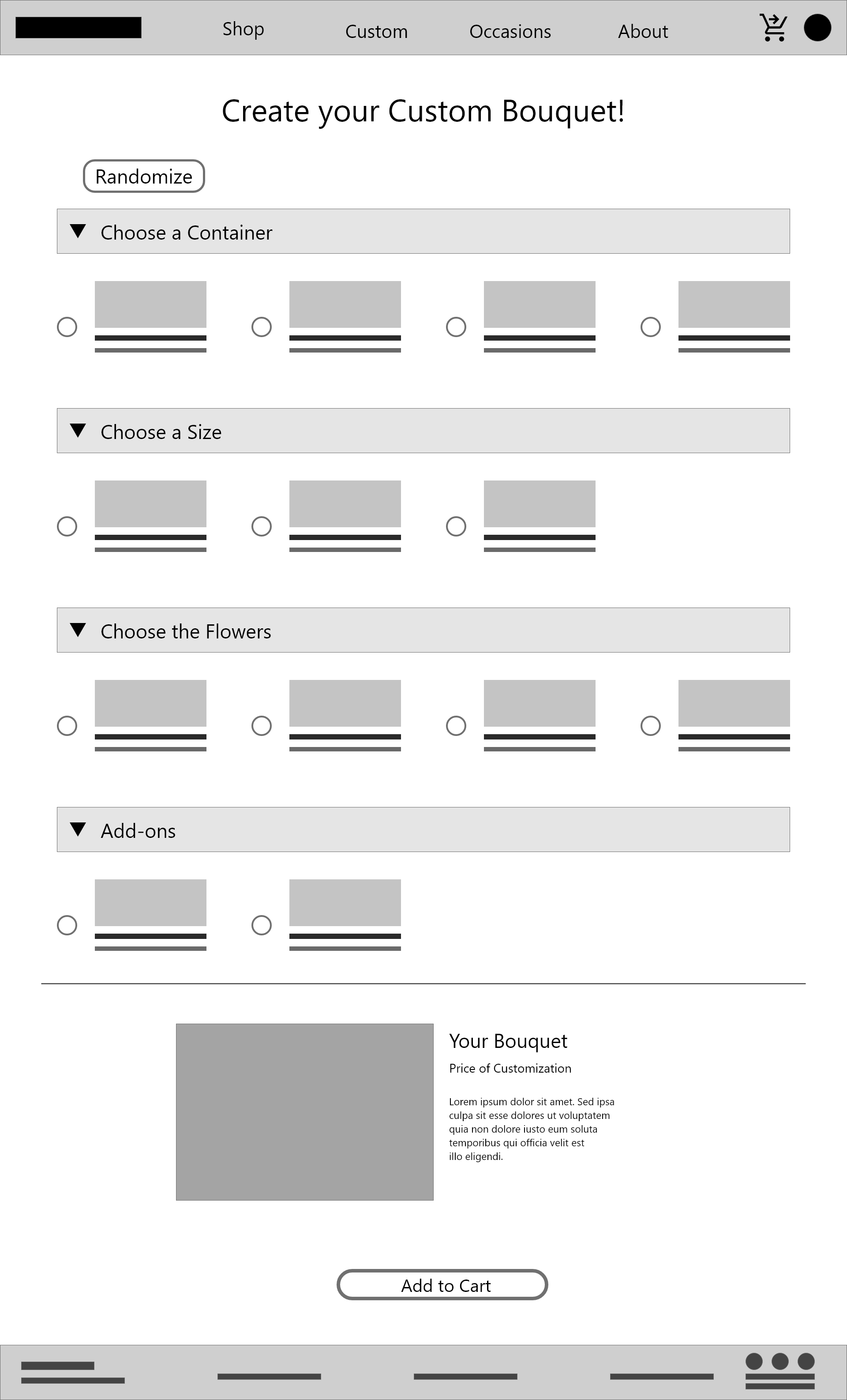
As I created the rest of the low-fi wireframes, I kept my problem statements and personas in mind. I focused on user convenience throughout the process.
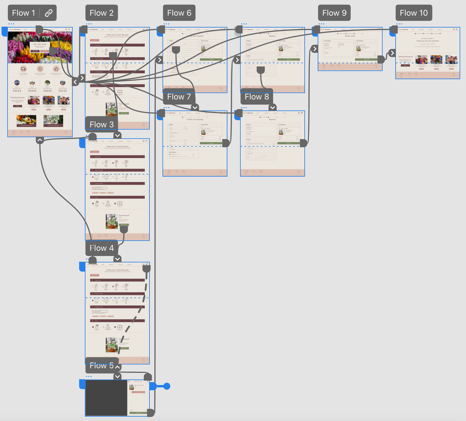
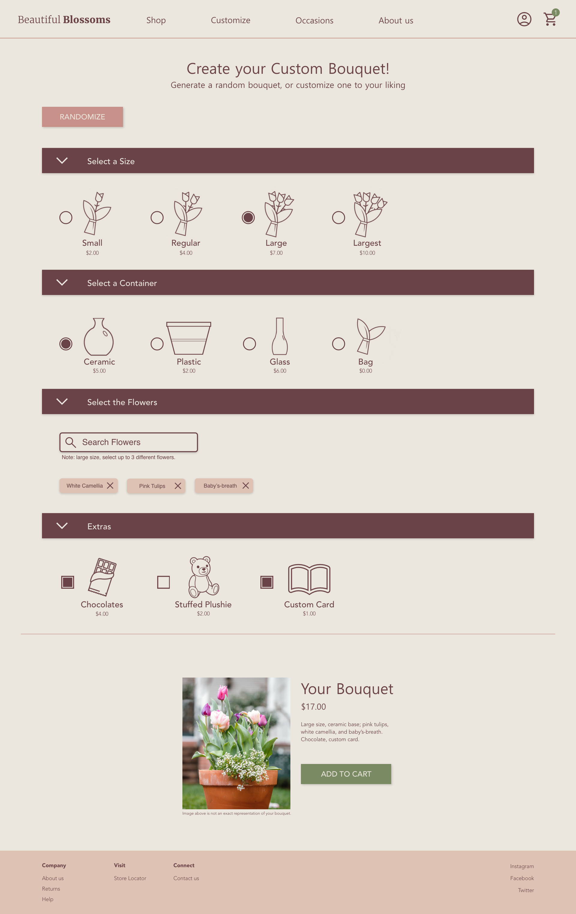
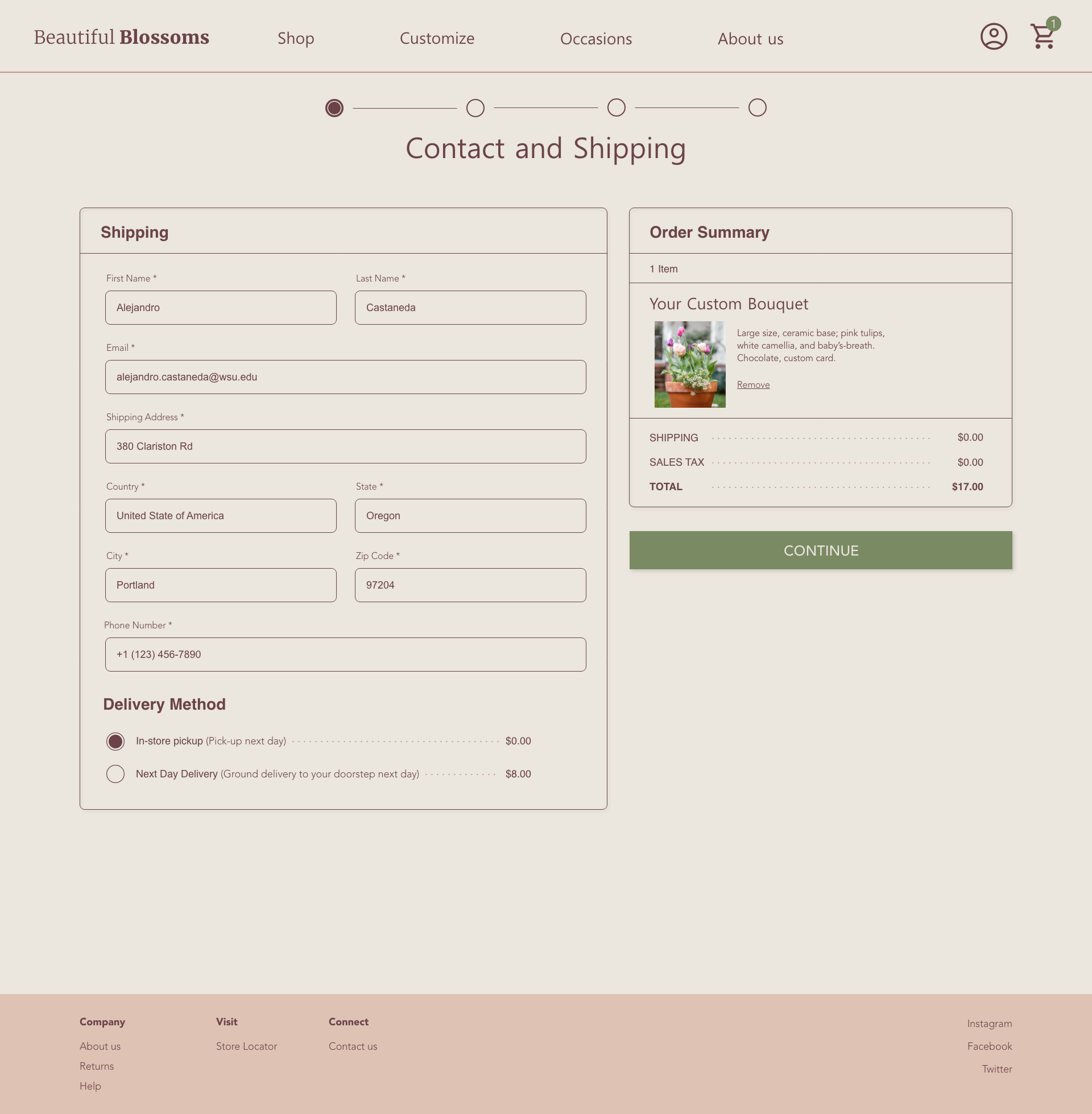
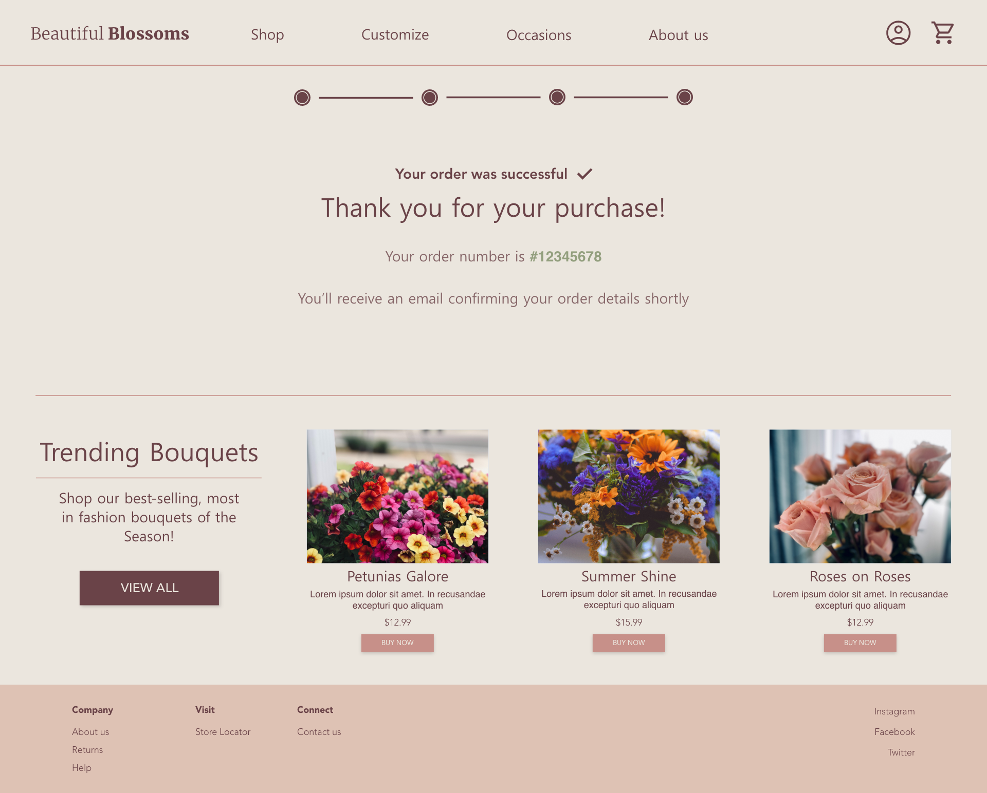
My low-fidelity prototype connects the core user flow of starting and completing a **custom bouquet order**.
View the Beautiful Blossoms low-fidelity prototype .

1. Users want to track their order price as they add items.
2. Users want to add multiple items to their cart easily.
1. Page indicators should show that a page was swiped.
2. A clear notification or quantity indicator for the cart helps users understand how many items they’ve added.
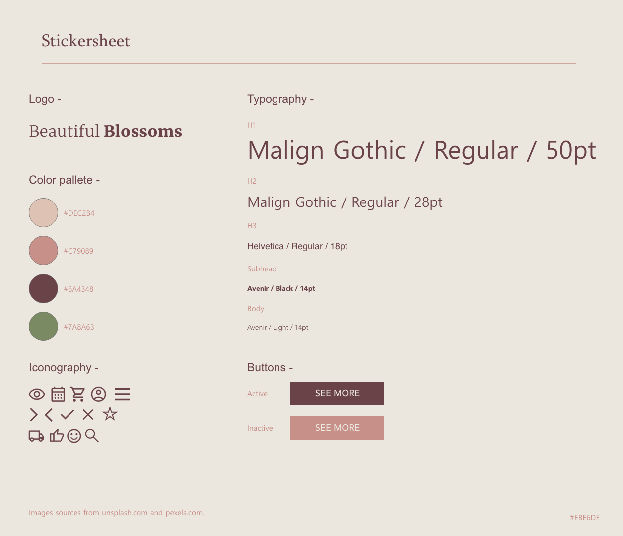
After conducting a usability study on early mockups, user feedback helped organize and refine my designs before moving on to high-fidelity prototypes.
BEFORE 1ST USABILITY
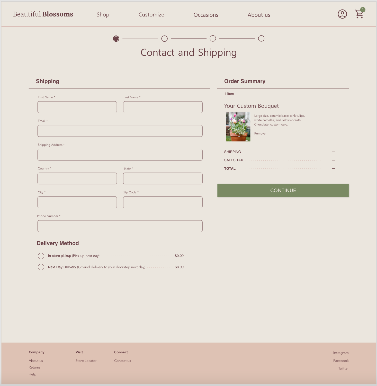
AFTER 1ST USABILITY
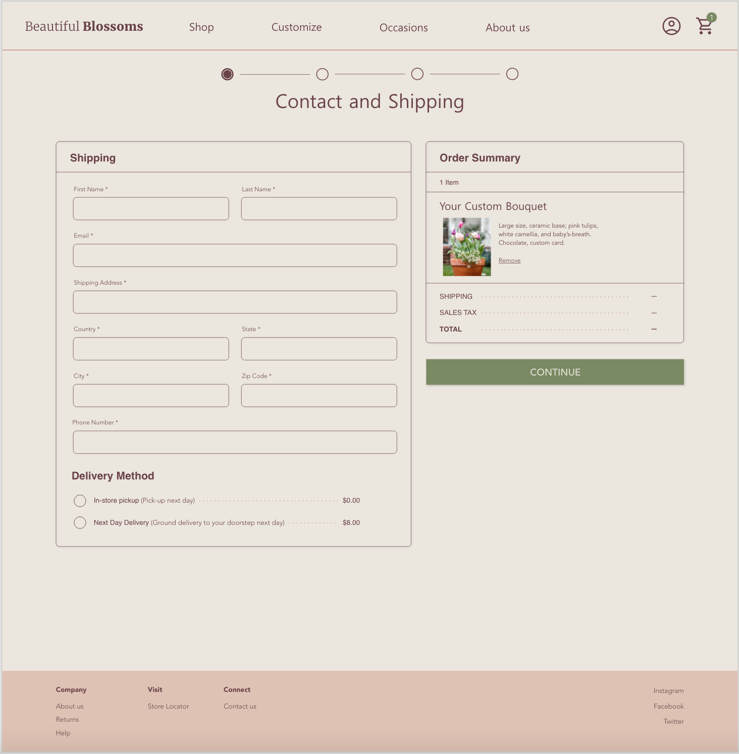
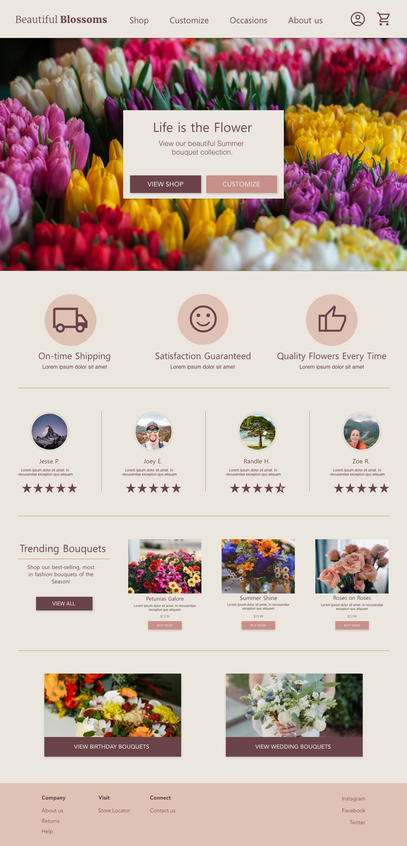
Because users might access this florist from a variety of devices, it’s essential to optimize the UX for each device. I created tablet and mobile mockups alongside the desktop design.
TABLET
MOBILE

1
I used clear textual hierarchy to properly guide the user’s eyes.
2
Navigation buttons were highlighted in green to guide the user through the ordering process.
3
On-screen information was limited and structured to address varying levels of technological literacy.
The high-fidelity prototype I created through the ideation process transforms the user flows into a clearer and simpler process for ordering a custom bouquet.
View the Beautiful Blossoms high-fidelity prototype .
