THE PRODUCT: Budd’s Broiler is a single-location steakhouse owned by the Anthony’s
Restaurant franchise in the Pacific Northwest. With its small-town location, they thrive on a community-centered experience.
The target audience is working adults. (Project: April – May 2022.)
THE PROBLEM: Working, busy adults have a family to feed and need to provide
them with a quality meal every night.
THE GOAL: Design a mobile-ordering app for Budd’s Broiler that allows users
to easily order a quality meal without hassle.
MY ROLE: UX designer and researcher; conducted usability studies, paper and digital wireframing, low and high-fidelity prototyping,
accounted for accessibility, and iterated on designs.
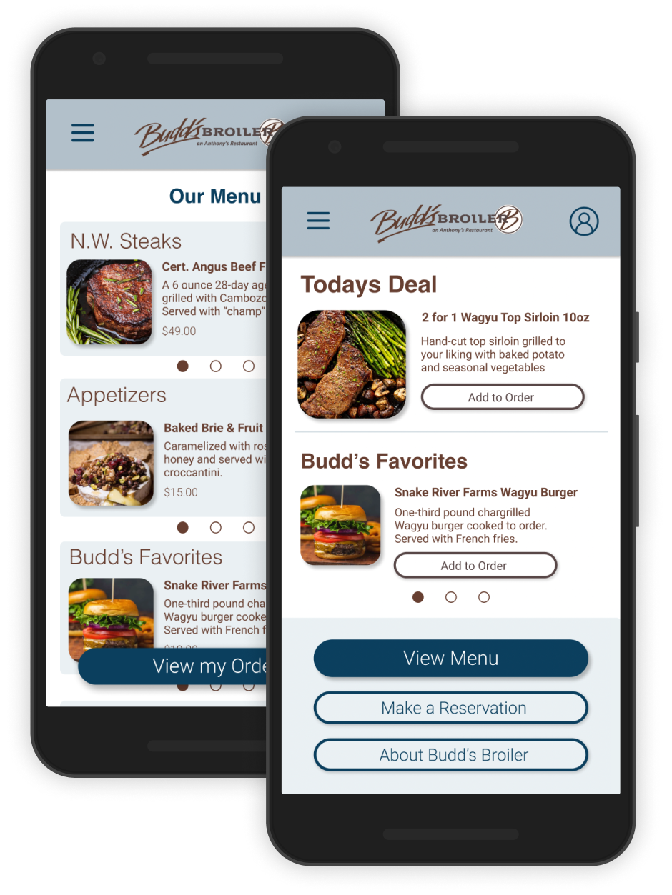
IMPACT: The Budd’s Broiler mobile-ordering app makes users feel like they’re
part of the app’s creation process.
One quote from a usability study:
“That was easy, I like the layout and colors! Looking forward to its completion!”
WHAT I LEARNED: As this was my first time going through the UX design process, I learned a lot. Putting the user front and center made me think from a different perspective when creating the Budd’s Broiler app design.
NEXT STEPS
1
Integration of these designs into Budd’s Broiler’s official app or website.
2
Conduct additional usability studies and continue to iterate on the design to meet user needs.
Using insights from a competitive audit, I created user personas to understand the target audience. I’ve identified the primary user group as non-vegan adults, aged 30-50, who enjoy eating out. This group confirmed my initial beliefs about Budd’s Broiler. The most common issues they reported included technological literacy, information architecture, and app accessibility.
PAIN POINTS
1
Technological Literacy
People who don’t use a computer or phone regularly can struggle with new technology.
2
Info Architecture
Text-heavy home screens and menus can be difficult to read and order from.
3
Accessibility
Many mobile ordering apps lack integrated assistive technologies, such as translators.
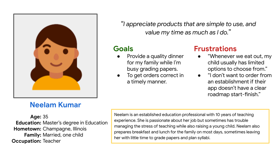
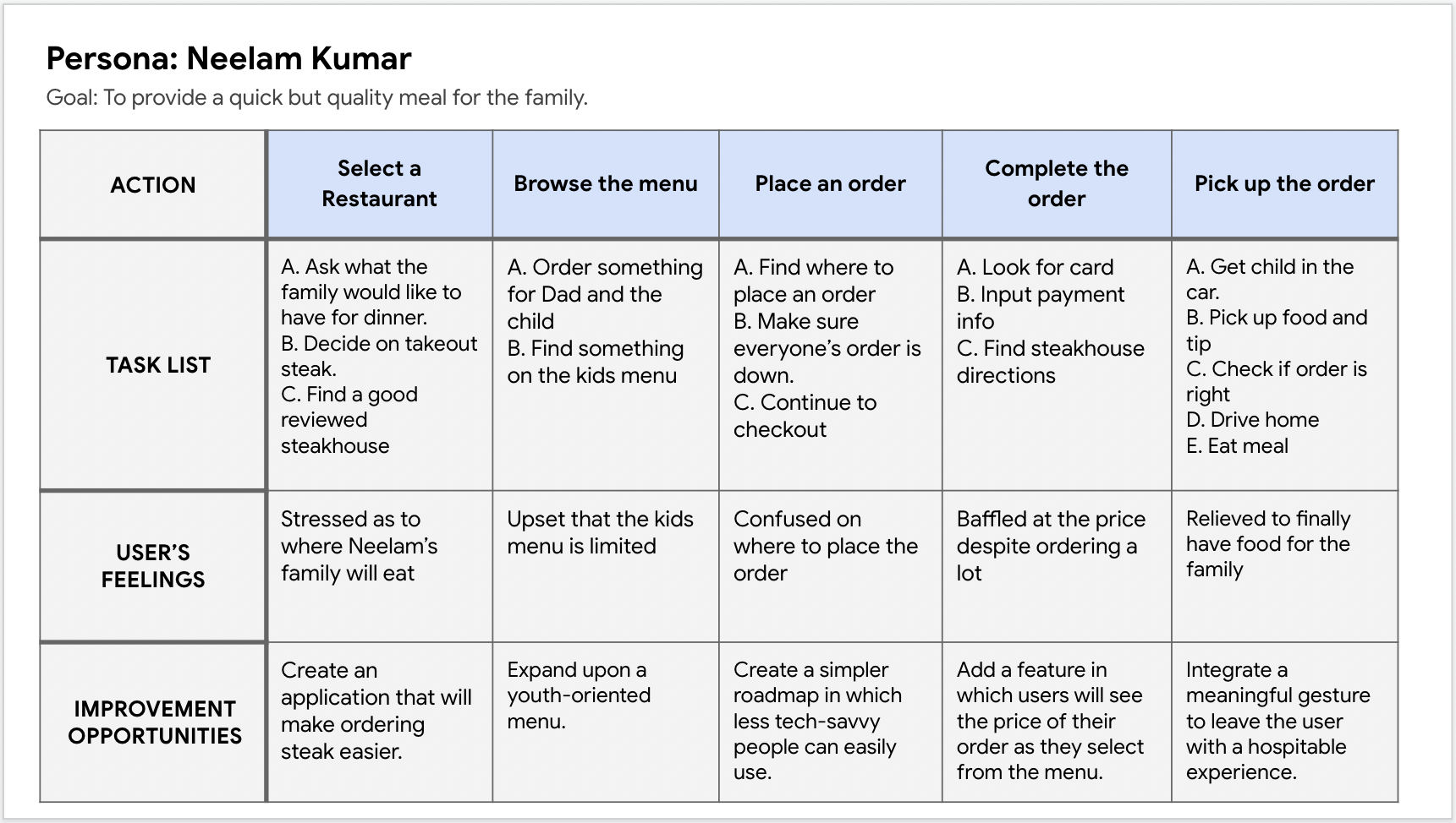
PERSONA: NEELAM
Problem Statement: Neelam Kumar is an education professional who wants to provide a quality dinner for her family because she’s busy with work responsibilities most nights.
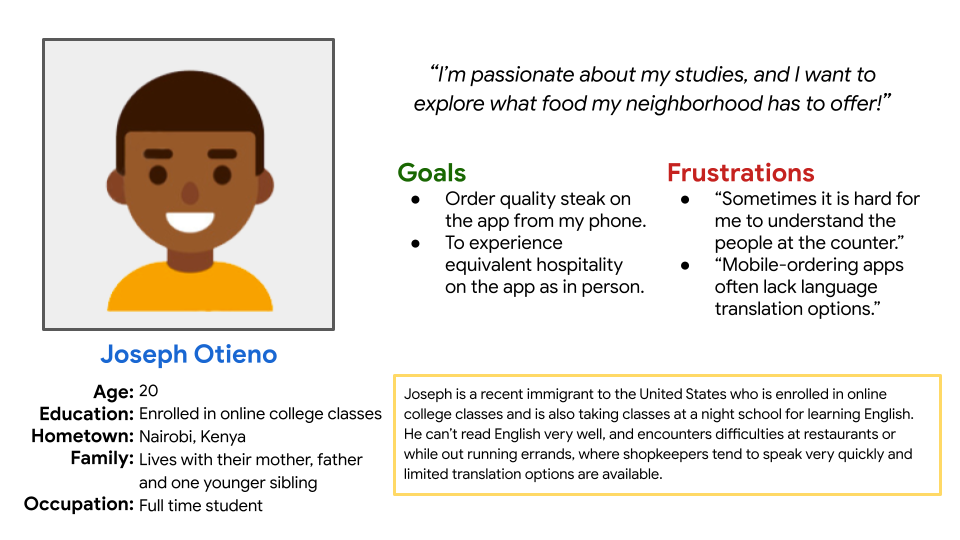
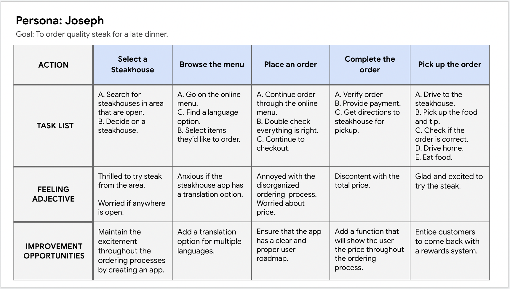
PERSONA: JOSEPH
Problem Statement: Joseph Otieno is an online college student who also studies English at night school. His busy schedule makes it hard for him to prepare food at home.
USER JOURNEY MAP: Through Neelam’s journey map, it’s clear that the user experience would greatly improve with the integration of a mobile-ordering app.
USER JOURNEY MAP: Through Joseph’s journey map, it’s clear that the user experience would greatly improve with the integration of a Budd's Broiler delivery service.
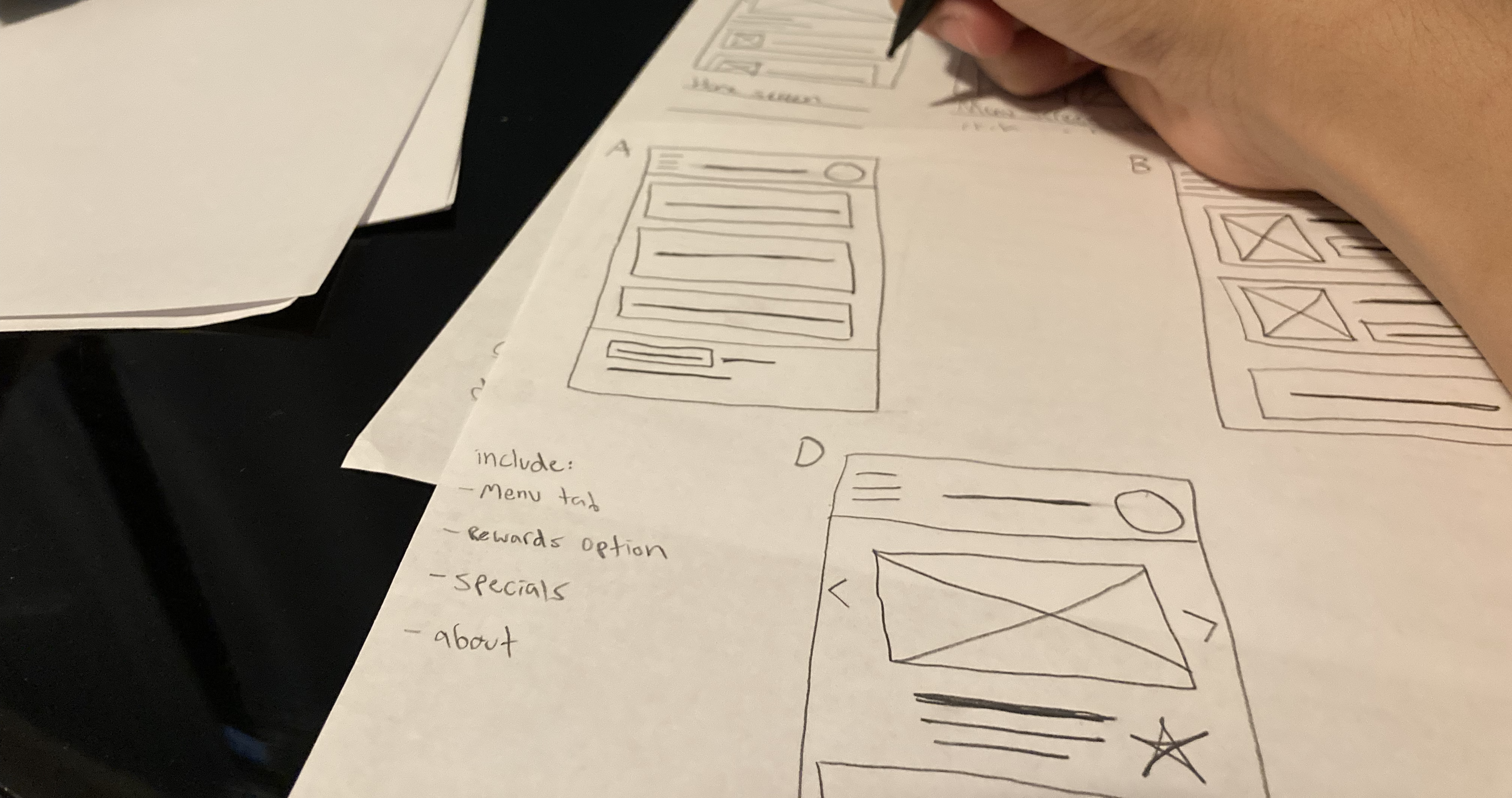
Taking time to sketch rough wireframes for each screen helped me keep the user’s pain points in mind. I tried to maintain a simple design to address the “technological literacy” pain point from the start.
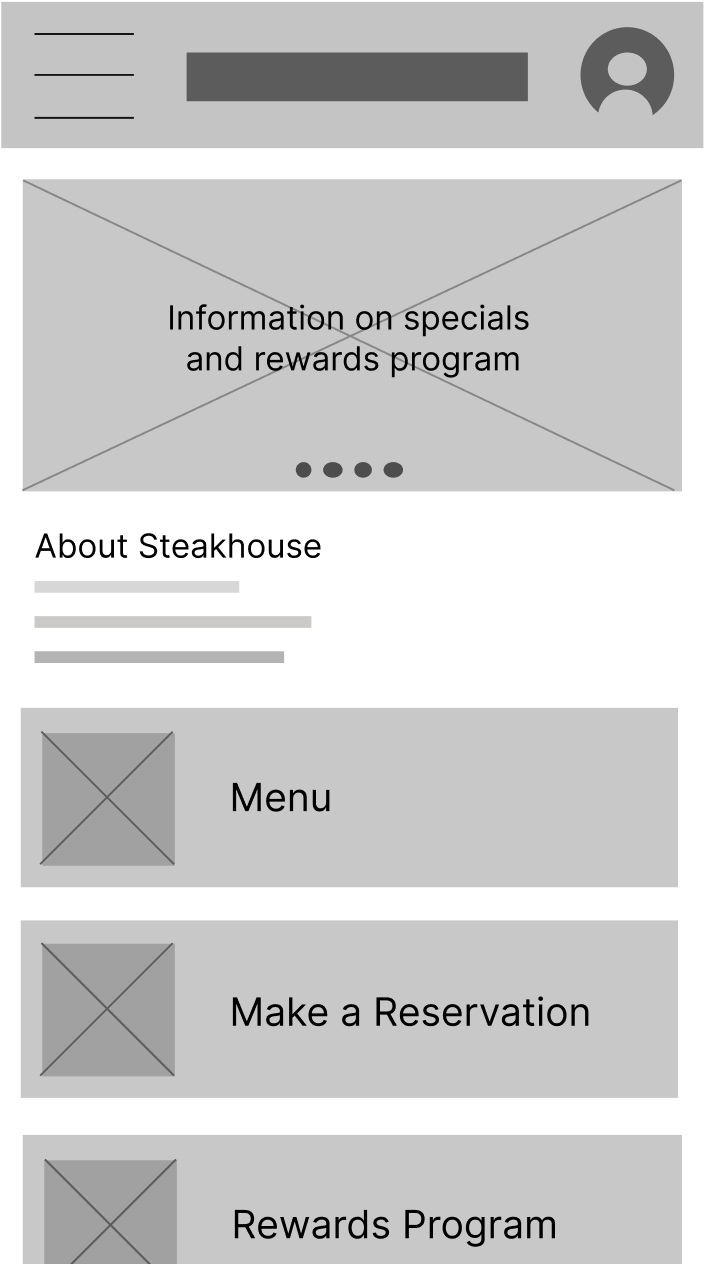
My main goal in transforming these wireframes from paper to digital was to keep the app’s original intentions and solutions intact.
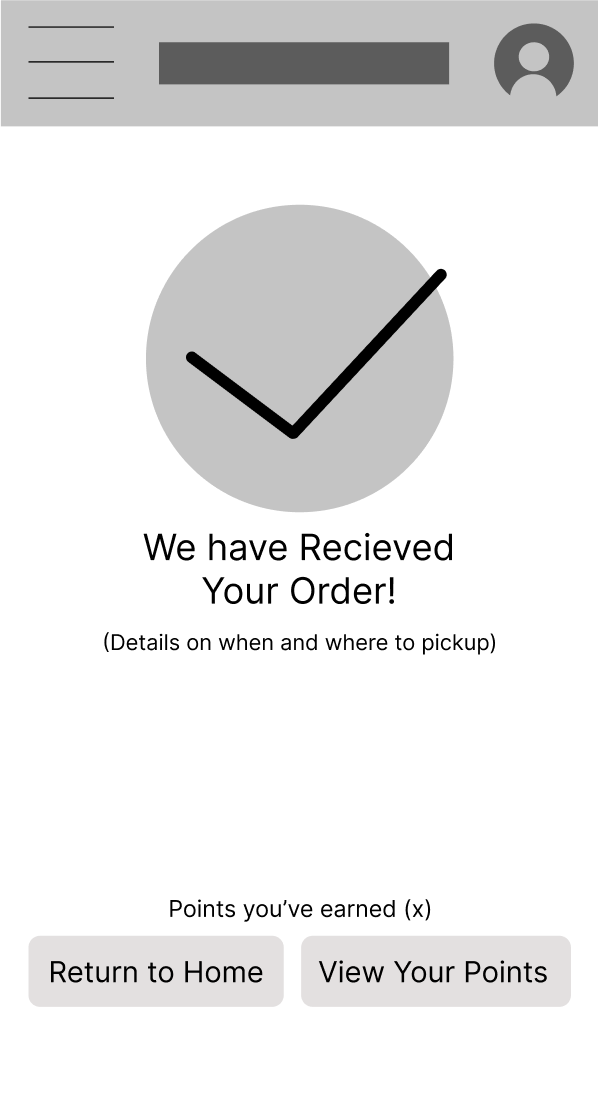
Clearly communicating when a user’s order is complete was vital. Ending the app experience on a high note increases the likelihood of users returning.
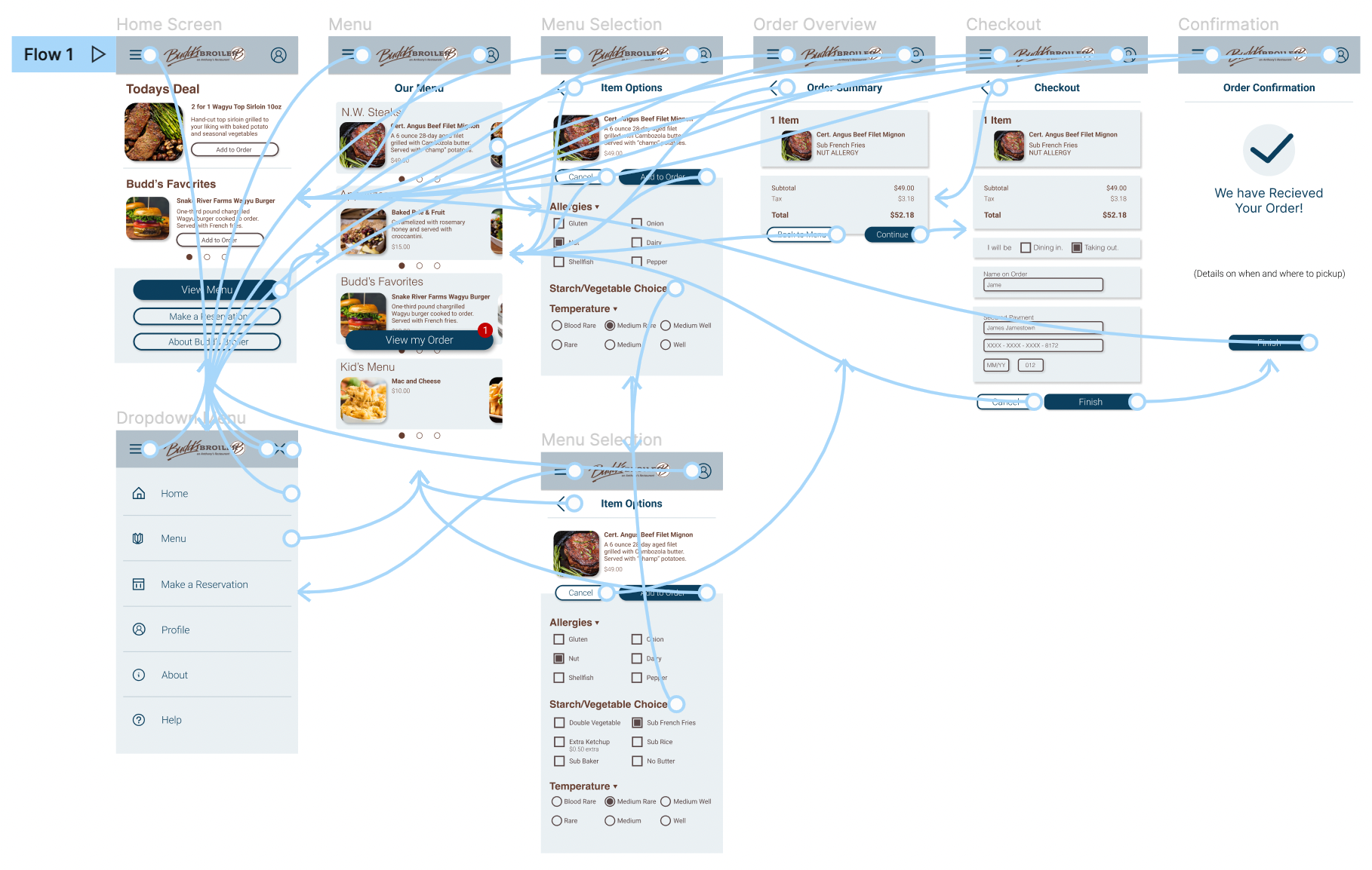
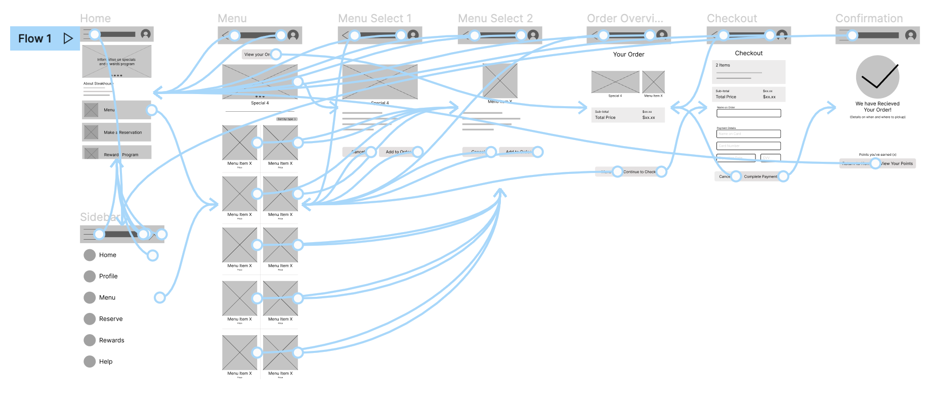
My low-fidelity prototype connected the main user flow of starting and completing an order. This prototype was used in a usability study with real users.
View the Budd's Broiler low-fidelity prototype .
1. Users want to track their order price as they’re making an order.
2. Users want the “specials” option integrated into the menu.
3. Users want the ability to add items to their cart.
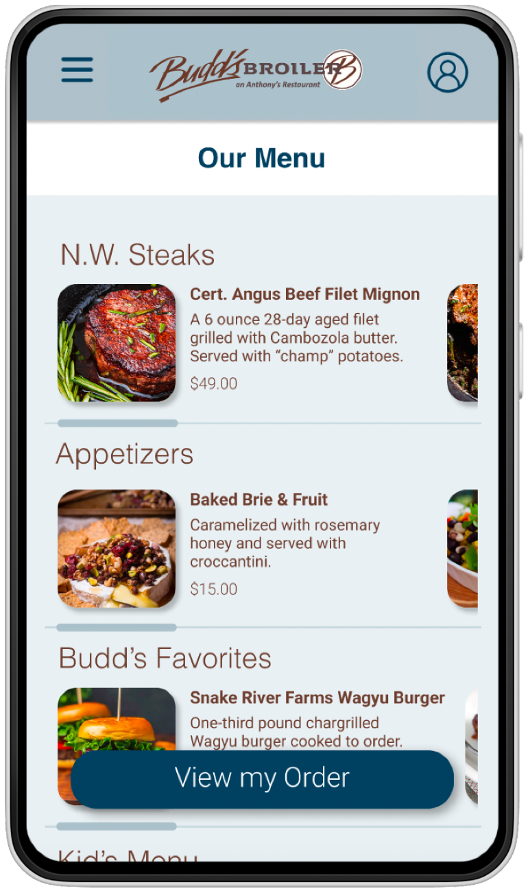
1. Page indicators should show that a page was swiped.
2. A notification or indicator showing what’s currently in the user’s order (quantity of items) is helpful.
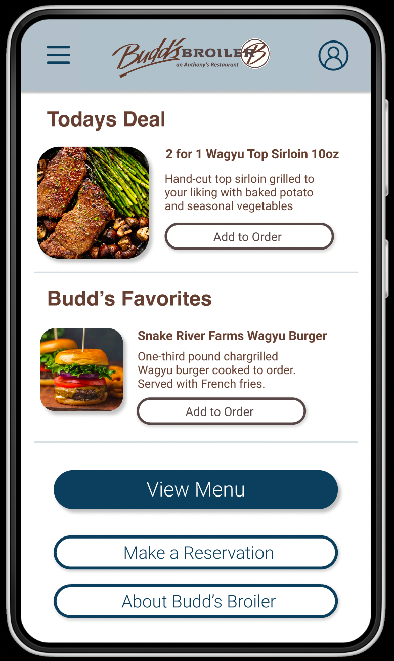
The early usability study I conducted between the low-fi and high-fi prototypes gave me insight into what functions might be missing and needed to change before designing the high-fidelity version. I was sure to include an image carousel.
BEFORE 1ST USABILITY
AFTER 1ST USABILITY
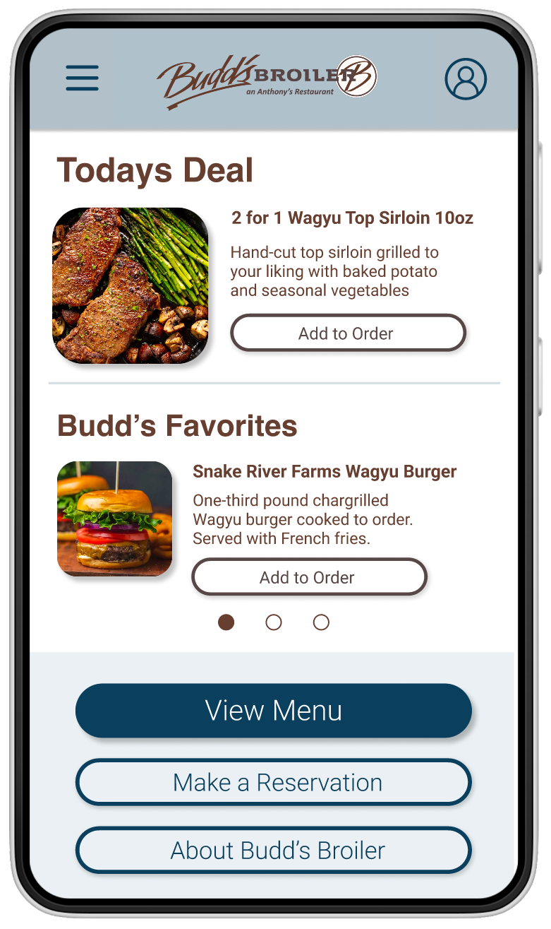
After the second usability study, while creating the high-fidelity prototype, I discovered some usability errors. I added an alert design when an item is added to your cart, and a clearer segmented menu for easier navigation.
BEFORE 2ND USABILITY
AFTER 2ND USABILITY
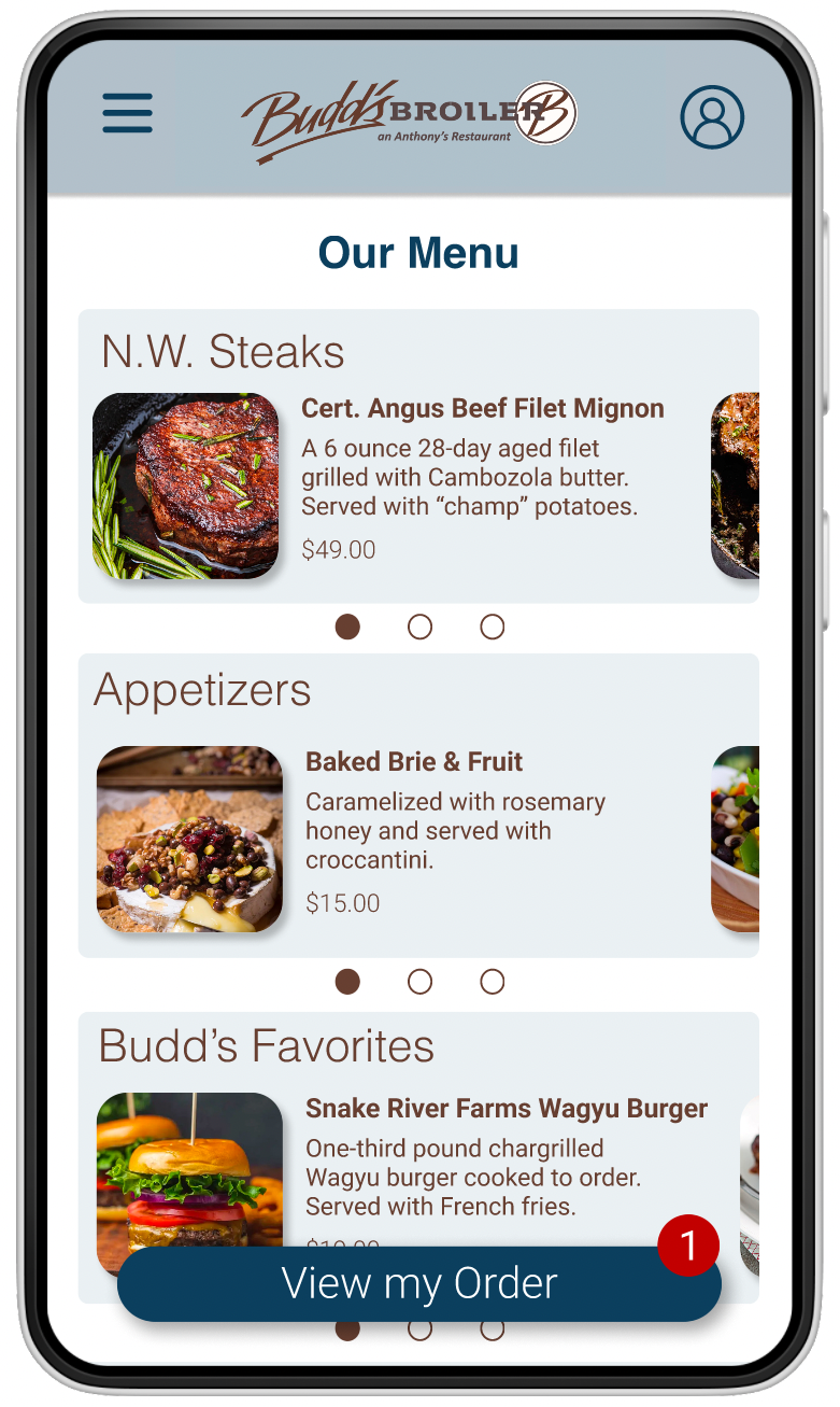
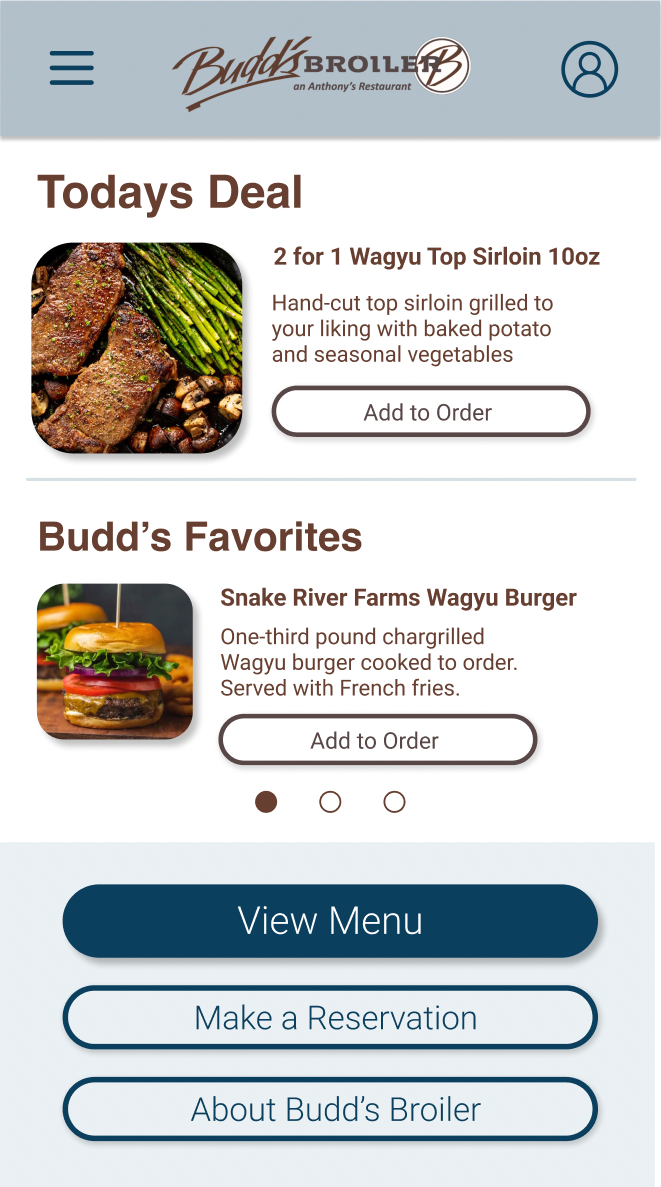
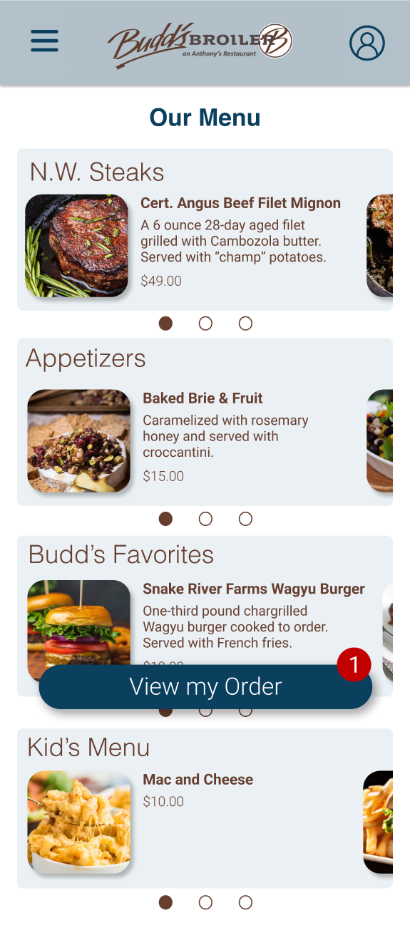
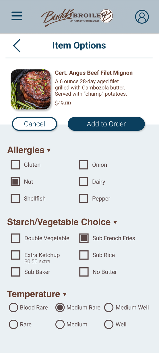
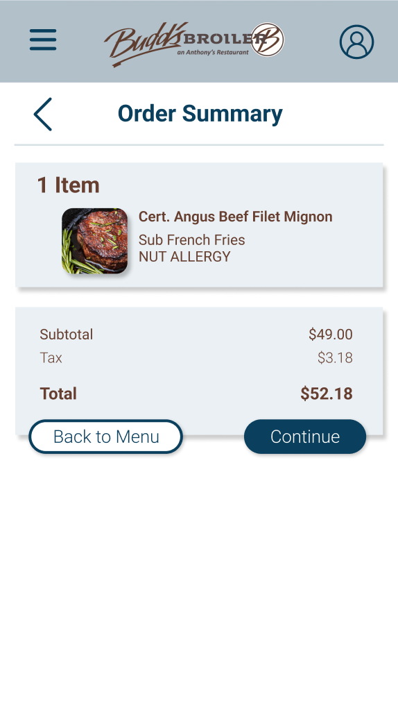
Text contrast was made easily readable for all users.
Notification pop-ups clearly communicate next actions to the user.
On-screen information was limited and structured for a wide range of technological literacy levels.
The high-fidelity prototype I created through the ideation process transformed the user flows into a clearer and easier process to navigate.
View the Budd's Broiler high-fidelity prototype .
